:format(webp)/cdn.vox-cdn.com/uploads/chorus_image/image/64850435/shutterstock_125741561.0.0.1524769232.0.jpg)
A good visualization helps you see what the data is telling you. The best visualizations help you you see things you never thought the data would tell you. These 22 charts and maps were, at least for me, in that category: all of them told me something I found surprising. Some of them genuinely changed the way I think about the world.
1) More than half the world’s population lives inside this circle
:format(webp):no_upscale()/cdn.vox-cdn.com/uploads/chorus_asset/file/1337710/population-map-1024x626.0.jpg)
This map can be summed up quite simply: a ton of people live in Asia. That circle encompasses China, India, Indonesia, Bangladesh, Japan, Vietnam, the Philippines, Burma, Thailand, South Korea, Nepal, Malaysia, North Korea, Taiwan, Sri Lanka, Cambodia, Laos, Mongolia, and Bhutan. Caitlin Dewey checked the math, and found that, yes, a bit more than 51 percent of the world’s population lives in those countries. “I’m glad I’ve moved to these parts, wrote Reddit user Valeriepieris, who posted the map. “All you guys outside the circle are just playing a sidegame.”
2) The British have invaded almost every country on Earth
:format(webp):no_upscale()/cdn.vox-cdn.com/uploads/chorus_asset/file/797216/BRITAIN_2388153b__1_.0.jpg)
In the book All The Countries We’ve Ever Invaded, British historian Stuart Laycock writes, “Out of 193 countries that are currently UN member states, [the British] invaded or fought conflicts in the territory of 171. That’s not far off a massive, jaw-dropping 90 per cent.” But a lot of those incursions are relatively obscure. For instance, the time British troops took the Ionian islands doesn’t make it into many non-Ionian history books. Laycock’s methodology is broad — he includes British pirates, privateers, and armed explorers whose activities were blessed by the government — and his research goes all the way back to the beginning. In a review, the Telegraph notes, “The earliest invasion launched from these islands was an incursion into Gaul — now France —at the end of the second century. Clodius Albinus led an army, thought to include many Britons, across the Channel in an attempt to seize the imperial throne. The force was defeated in 197 at Lyon.”
3) Africa is much bigger than you think
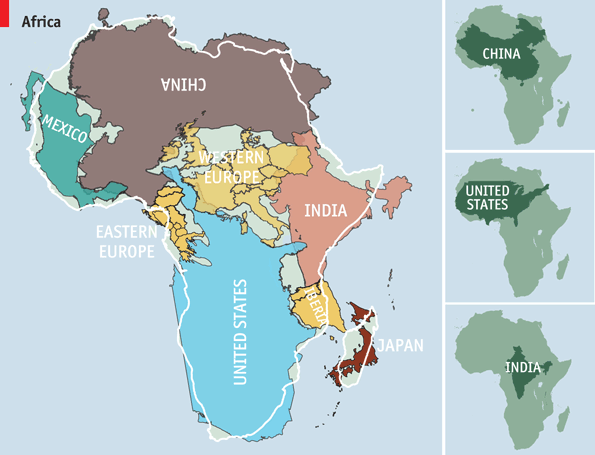
Most maps you see are based on the “Mercator projection,” so named for Gerardus Mercator, who came up with it in 1559. The Mercator projection is excellent for sailing, as it shows constant bearing as a straight line. But it’s terrible for estimating the size of large masses of land — particularly when they’re close to poles. Under the Mercator projection, for instance, Africa looks to be about the same size as Greenland; it’s actually 14 times larger. The Economist — building on work by Kai Krause — made this graphic showing Africa’s true size: bigger than not just Greenland but China, the United States, India, and Western Europe put together.
4) The wealthiest American in every state
:format(webp):no_upscale()/cdn.vox-cdn.com/assets/4844730/richmap2.png)
The geography of wealth inequality doesn’t get much attention. But it’s stark. There are about 450 billionaires with American citizenship — and almost 200 of them live in New York and California. The result is this map. In some states, the richest people are well-known names, like Bill Gates or Sheldon Adelson. But how many of you know Leslie Wexler, CEO of the L Brands corporation and, with $5.7 billion, the richest man in Ohio? How about Anne Cox Chambers, who holds a controlling interest in Cox Enterprises and, with an estimated net worth of $15.5 billion, is the richest person in Atlanta?
5) Switzerland is the best place to be born
:format(webp):no_upscale()/cdn.vox-cdn.com/uploads/chorus_asset/file/1341384/places_to_be_born.0.jpg)
The Economist’s Intelligence Unit tried to assess which country gave its children the best chance of a happy, safe, and prosperous life. “Being rich helps more than anything else,” they write, “but it is not all that counts; things like crime, trust in public institutions and the health of family life matter too.” The final measure factors in everything from income to geography to demography. When all is said and done, Switzerland leads the list, with Australia and Norway close behind. The United States tied with Germany for 16th place.
6) Liberia, Myanmar, and the United States are the only countries that don’t use the metric system
:format(webp):no_upscale()/cdn.vox-cdn.com/uploads/chorus_asset/file/779068/map-of-countires-that-use-metric-system-vs-imperial.0.jpg)
As Vox’s Susannah Locke wrote, “The measuring system that the United States uses right now isn’t really a system at all. It’s a hodgepodge of various units that often seem to have no logical relationship to one another — units collected throughout our history here and there, bit by bit. Twelve inches in a foot, three feet in a yard, 1,760 yards in a mile.” That’s why the rest of the world uses the metric system, where “all you need to do is multiply or divide by some factor of 10 — 10 millimeters in a centimeter, 100 centimeters in a meter, 1,000 meters in a kilometer. Water freezes at 0°C and boils at 100°C.”
7) America is so big that its states are the size of countries
:format(webp):no_upscale()/cdn.vox-cdn.com/uploads/chorus_asset/file/1327708/america-is-really-big-were-so-big-that-our-states-are-bigger-than-many-countries-check-out-this-map-showing-states-that-are-the-size-of-whole-nations.0.jpg)
This map puts the sheer size of the United States into perspective. Montana is about the size of Japan. California is roughly as large as Iraq. Arizona is as large as the Philippines. Though, to be honest, I find this map surprising because some countries are much larger than I’d realized. I wouldn’t have guessed, for instance, that Burma is as large as Texas, or that New Zealand is the size of Colorado.
8) Much of America is uninhabited
:format(webp):no_upscale()/cdn.vox-cdn.com/uploads/chorus_asset/file/1326748/the-flip-side-half-of-america-in-green-is-uninhabited.0.jpg)
This map, by Nik Freeman, pulls out the 4,871,270 census blocks — covering 4.6 million square kilometers — where no one lives. That tends to mean one of three things: the first is that the land is uninhabitable, perhaps because it’s covered by a lake. The second is that laws or other kinds of sanctions prevent settlement, for instance on national parks. The third is that it’s a commercial or industrial zone where people work but no one actually lives. “Human geographers spend so much time thinking about where people are,” Freeman writes. “I thought I might bring some new insight by showing where they are not.”
9) The map of world wealth
:format(webp):no_upscale()/cdn.vox-cdn.com/uploads/chorus_asset/file/993992/world_by_wealth.0.png)
This is a map of the world weighted not by land mass or navigation lines but around how much wealth each country has. As you can see, North America and Western Europe balloon to enormous proportions — even after adjusting for purchasing power, 46 percent of global wealth in 2002 was in their hands. The horror of this map is the shrunken husk of Africa. That’s a lot of people living with very little.
10) Fewer people are dying from war than ever before
:format(webp):no_upscale()/cdn.vox-cdn.com/uploads/chorus_asset/file/1005760/lesswargraph.0.png)
People sometimes complain that the press never writes about all the planes that land safely. By the same token, it also doesn’t write about all the people who aren’t dying in wars. But the decline in war-related deaths is a huge story — one of the most encouraging of the 20th century, for sure. “On average, about 15 percent of people in prestate eras died violently, compared to about 3 percent of the citizens of the earliest states,” wrote Harvard’s Steven Pinker. “The rate of documented direct deaths from political violence (war, terrorism, genocide and warlord militias) in the past decade is an unprecedented few hundredths of a percentage point.” Vox’s Zack Beauchamp explains the reasons for the decline here, and it includes some culprits you probably don’t expect, like nuclear weapons.
11) The most dangerous drugs in America are perfectly legal
:format(webp):no_upscale()/cdn.vox-cdn.com/uploads/chorus_asset/file/3360478/drug_deaths.0.png)
As German Lopez writes, “There’s one aspect of the war on drugs that remains perplexingly contradictory: some of the most dangerous drugs in the US are perfectly legal.” This chart uses data from the Centers for Disease Control and Prevention to make a counterintuitive point: the deadliest drugs in America are legal. In some cases, those drugs are deadlier because their legal status makes them more widely available. If heroin were as easy to get as tobacco, more people would surely die from it each year. But that’s not true in all cases. Alcohol is much more dangerous than marijuana, but marijuana is illegal in most states, while alcohol is legal for those over age 21.
12) The Philippines is the world’s most emotional country. Singapore is its least.
:format(webp):no_upscale()/cdn.vox-cdn.com/uploads/chorus_asset/file/1333786/emotional_countries.0.jpg)
Since 2009, Gallup has been polling people in 150 countries and territories about their everyday emotional experiences. The questions are things like “Did you smile or laugh a lot yesterday?” and “Did you experience [enjoyment/physical pain/worry/sadness/stress/anger] during a lot of the day yesterday?” Only 36 percent of Singaporeans reported experiencing either positive or negative emotions in a given day — making them the least emotional country in the world. By contrast, the Philippines are the world’s most emotional country, with 60 percent saying they had either a positive or negative emotional experience on a given day. America, by the way, is the 15th most emotional country.
13) Germany and Japan have the world’s oldest populations. Niger has the youngest.
:format(webp):no_upscale()/cdn.vox-cdn.com/uploads/chorus_asset/file/783616/world_ages.0.jpg)
Much of what looks like politics and economics is actually just demographics in disguise. Countries with aging populations often end up with high budget deficits and weak economic growth because there are too few workers to support the many retirees. Countries with extremely young populations often end up in political chaos — particularly if there aren’t enough jobs to go around. Right now, Germany and Japan have the world’s oldest populations, with a median age of 46.1. Niger has the world’s youngest population, with a median age of, shockingly, 15.1.
14) Snapchat is more popular than Twitter among millennials
:format(webp):no_upscale()/cdn.vox-cdn.com/uploads/chorus_asset/file/1004870/chartoftheday_2570_Most_popular_social_apps_among_millennials_n.0.jpg)
According to data collected by Comscore and compiled by Statista, more millennials have installed Snapchat on their phones than Twitter. And Instagram is more popular than either of those. This data doesn’t tell us much about how often the different services are used, but it does speak to the incredible popularity of picture-based messaging apps among young people. Next time you hear about Snapchat seeing a $10 billion valuation, this chart is why.
15) Half of US GDP comes from these 23 orange blotches
:format(webp):no_upscale()/cdn.vox-cdn.com/uploads/chorus_asset/file/1323508/half_of_gdp_in_metro_areas.0.png)
Half of America’s gross domestic product comes from the 23 orange blotches on this map. The other half comes from the vast acres of blue. Those orange blotches are America’s largest metro areas — and they absolutely power the American economy. But though small in size, they’re large in population: about 110 million people live in those orange blotches, says Reddit user Atrubetskoy, who created the map. So what you’re seeing on this map isn’t just that there’s a lot of economic activity compressed into some very small spaces in America, but also that there are huge swaths of the American landscape where not that many people live.
16) Antarctica’s weird time zones
:format(webp):no_upscale()/cdn.vox-cdn.com/uploads/chorus_asset/file/796428/UTC_hue4map_ATA.0.png)
The South Pole is located almost smack in the center of Antarctica. That puts the continent on every line of longitude — and, in theory, in every single timezone. But as an interesting Wikipedia article on the subject explains, the extreme day-night cycles make that impractical, and thus time zones are often based on territorial claims. The result is that “many stations use the time of the country they are owned by or the time zone of their supply base (e.g. McMurdo Station and Amundsen–Scott South Pole Station use New Zealand time due to their main supply base being Christchurch, New Zealand). Nearby stations can have different time zones, because of belonging to different countries.”
17) Guyana has the highest suicide rate in the world
:format(webp):no_upscale()/cdn.vox-cdn.com/uploads/chorus_asset/file/1003854/suicide_by_country.0.jpg)
According to data gathered by the World Health Organization, Guyana has the highest suicide rate in the world, with 44 suicides per 100,000 people. That puts them slightly ahead of even North Korea, which has 38.5 suicides per 100,000 people. Among large countries, South Korea, with 28.5 suicides per 100,000 people, and Russia, with 18.5 suicides per 100,000 people, have particularly bad records. The suicide rate in the US is 12.1 per 100,000 people.
18) If the world were as tightly packed as New York City, everyone could fit into Texas
:format(webp):no_upscale()/cdn.vox-cdn.com/uploads/chorus_asset/file/993582/the-worlds-population-concentrated-small.0.png)
This fascinating infographic from Per Square Mile shows that if everyone in the world lived as close together as, say, New Yorkers, they could all fit into Texas. Which is all to say that we’ve got a lot more land than we have people. But there’s an important caveat: it takes a lot of land to support all those people. As Per Square Mile goes on to note, if everyone in the world required as much land to support them as Americans do, we would need four earths.
19) Assault deaths in America are falling
:format(webp):no_upscale()/cdn.vox-cdn.com/uploads/chorus_asset/file/1008730/assault-deaths-oecd-ts-all-new.0.png)
There are more gun-related deaths in America than anywhere else in the developed world. But people know that already. These are meant to be surprising maps and charts. So how about this: for all the horrible shootings in recent years, assault deaths in the Unites States have actually been falling sharply. This includes gun deaths. Michael Planty and Jennifer Truman of the Bureau of Justice Statistics found that gun homicides fell 39 percent between 1993 and 2011. (For much more on guns in America, ready Dylan Matthews’s cardstack.)
20) We’ve cut childhood mortality almost in half since 1990
:format(webp):no_upscale()/cdn.vox-cdn.com/uploads/chorus_asset/file/1007844/mortalityrate.0.png)
Let’s continue with the good news for a minute. Between 1990 and 2013, the mortality rate for children under five was cut nearly in half. This is some of the best news in the history of the human race. “That includes an over two-thirds drop in East Asia, Latin America/Caribbean, and Northern Africa, and a 48 percent drop in sub-Saharan Africa, wrote Dylan Matthews. Out of 195 countries, 191 have seen declines. There are no gains in development quite like saving a child: you haven’t only saved a life, but you’ve saved a life with many years yet to live. Still, there’s a ways yet to go: 17,000 children die every day, and the Millennium Development Goals commit us to cutting childhood mortality by two-thirds of its 1990 levels.
21) Global population will explode to 11 billion people by 2100
:format(webp):no_upscale()/cdn.vox-cdn.com/uploads/chorus_asset/file/987422/Screen_Shot_2014-09-18_at_1.37.33_PM.0.png)
There were about 200 million people on earth at the turn of the first century. By the 10th century, there were about 300 million. We didn’t hit a billion until the 19th century. But things really sped up from there. Today there are almost 7 billion people on earth — and world population is growing quickly. The latest UN forecasts predict there will be roughly 11 billion people on earth come 2100. That’s a lot of mouths to feed, and we really don’t know how we’ll feed them.
22) You are a tiny speck of nothingness
:format(webp):no_upscale()/cdn.vox-cdn.com/uploads/chorus_asset/file/680680/lanikea_map.0.png)
This is perhaps the most surprising map of all. Think about yourself for a moment. You’re a pretty big deal, right? The things that happen to you feel very consequential, don’t they? And for you, and your family, and your friends, they are. But this is a map of our corner of the universe. It’s called Laniakea and it’s got more than 100,000 galaxies and stretches more than 500 million light years across. You can’t even see Earth in it, much less your city, much less your house. “It’s hard to wrap one’s head around how enormous this is,” writes Brad Plumer. “Each of those points of light is an individual galaxy. Each galaxy contains millions, billlions, or even trillions of stars. Oh, and this all is just our little local corner of an even broader universe. There are many other galaxy superclusters out there.” You can see more in this video from Nature. It kind of puts things in perspective, doesn’t it?
Correction: A previous version of this article identified Per Square Mile as One Square Mile. The text has been corrected.