The top 10 iconic Toronto logos
Iconic Toronto logos offer a portal for nostalgia that's quite remarkable. Simple symbols carry with them layers of history fostered mostly by our (over) exposure to them. It's no surprise that banks, drug stores and restaurants feature prominently on this list. Ubiquity is mostly responsible for the iconic nature of these logos rather than, say, design genius. The two aren't mutually exclusive, of course, but if these symbols have any power to induce nostalgia it's because of our familiarity with them.
One note about the selection criteria. While some of the companies on the list are national (and beyond), they were founded in Toronto. For the most part, I've tried to stay away from stylized fonts in favour of true logos. This is why something like the 1050 Chum branding doesn't make the cut, even as it is a well known Toronto sign.
Here are 10 iconic Toronto logos that have helped shape the visual identity of the city.
Shopper's Drug Mart
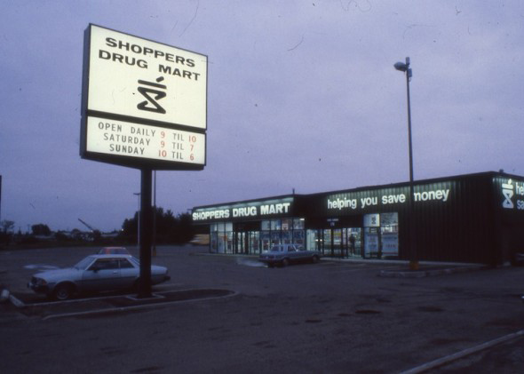
The Shopper's Drug Mart font has undergone a number of redesigns over the years, but the iconic logo has been around since the beginning (over 50 years ago).
City of Toronto logo
Ubiquitous around the city, our official logo was selected in 1998 after amalgamation. The image above shows the three finalists, with the winning design at the right.
The TTC
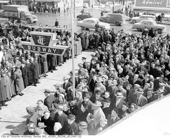
Quite possibly the most iconic Toronto logo of them all, the TTC might get a lot of things wrong, but the design of the logo should never change.
The Toronto Zoo

Toronto Zoo's logo is an example of a pared down design that becomes iconic before it's even aged much.
Roots
The logo of the Toronto-based clothing company is an exercise in explicit Canadiana that once seen is hard to forget.
The Toronto Maple Leafs
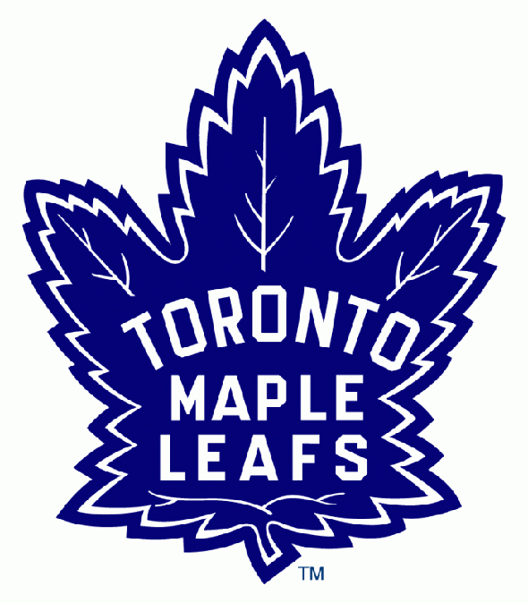
The standard Leafs' logo, similar to the Canadian flag could be depicted above, but the retro logo probably has better memories tied to it from the time when the team was winning Stanley Cups.
Harvey's
Harvey's updated their logo long ago, but the original orange hamburger is an iconic bit of Toronto history that's worth remembering.
TD Bank
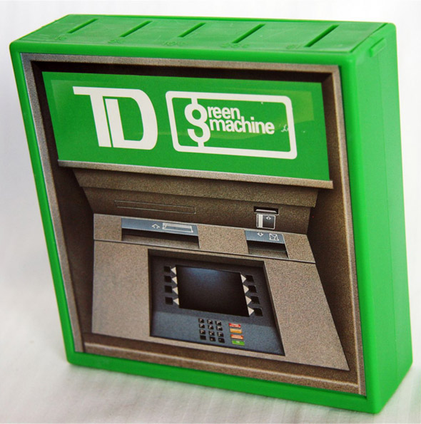
The bank that brought Toronto the "Green Machine" (back when one needed to brand an ATM because it was so novel) still sports the two-letter logo it did back then.
Diamond Taxi
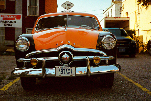
The Diamond Taxi logo has been cruising the streets of Toronto since 1949.
Gray Coach Lines

Gray Coach Lines was dissolved by the TTC in the early 1990s, but its buses were once a common sight on Toronto roads and Ontario Highways. A rebranding effort in its final years brought the moderninized style logo.
Toronto Blue Jays (original logo)
The Toronto Blue Jays logo has received a few overhauls since the original 1977 design, but I'm sticking with that one because it's the one that's implanted in memory from growing up in Toronto during the 1980s.
What did I miss? Share your favourite Toronto logos in the comments.
Lead photo by Adam Finley
Latest Videos
Latest Videos
Join the conversation Load comments