The Shiba Inu-based Doge meme at this point has too many permutations to count, though all of them tend to conform to one iron-clad formatting rule: Doge thoughts are expressed in the heavily ridiculed Comic Sans, to the exclusion of all other fonts. So it’s not a stretch to say that a graphic designer who wants to start implementing “Doge Sans” is making a radical proposal.
Redditor Grazsebastian, a member of the site’s thriving Dogecoin community, acknowledges that Comic Sans is “integral” to Doge’s identity as it stands. But if Doge and its cryptocurrency are going to reach the moon, he argued, they’ll need a typeface all their own. After slamming Comic Sans as an unprofessional look (surely why it was used in the first place), he explained—in r/dogecoin’s obligatory Comic Sans, no less—how he envisioned the new font:
“I think if we are to grow as a currency we need to have a unique identity – and a custom tailored typeface is a first step towards that! Doge sans is inspired by Comic Sans but has it’s own style and dogeness about it – keep in mind that we can design this typeface together so that everyone shibe is satisfied since I’m much open for critisism [sic].”
Here’s Grazsebastian’s progress so far—a lowercase alphabet, since Shibes aren’t much for capitalization:
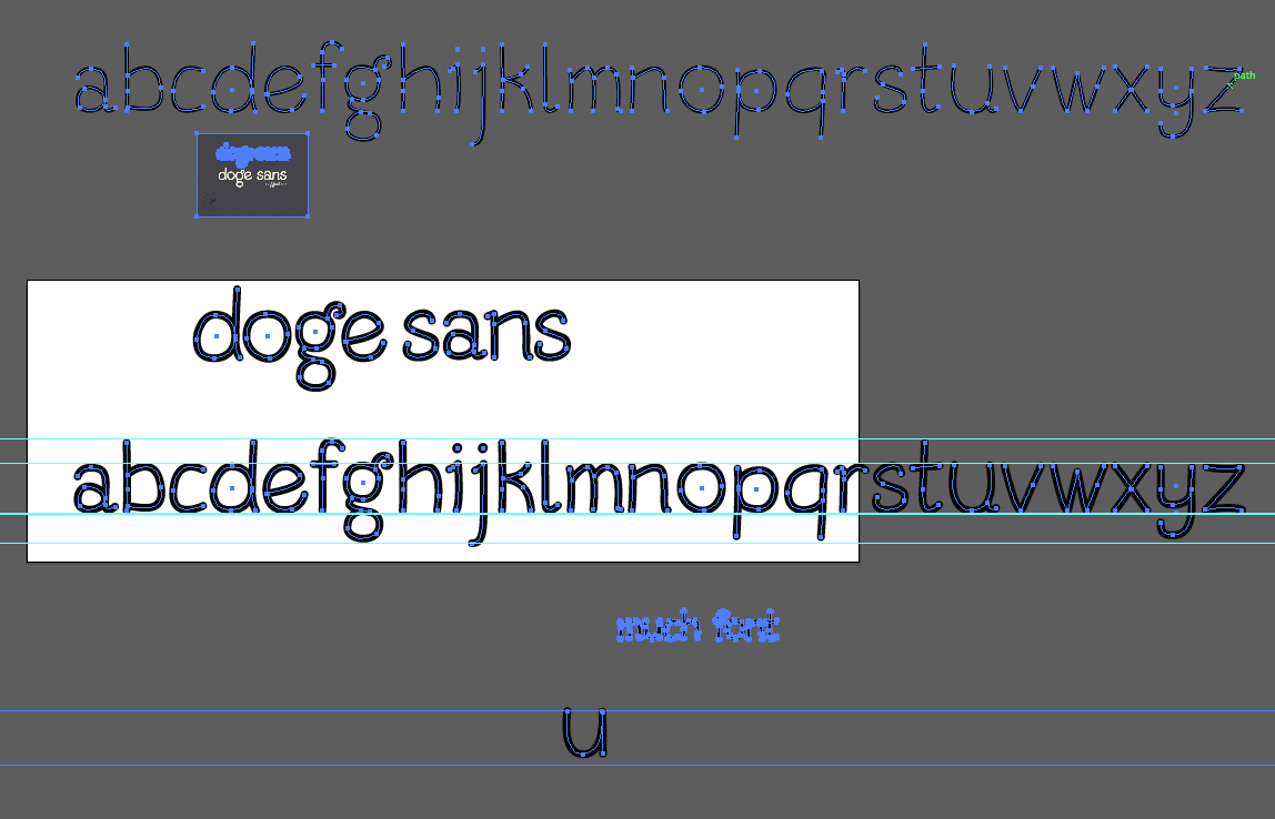
Images via Imgur
Even those enthusiastic about the project doubted that Comic Sans would ever be displaced in the pantheon of all things Doge. Kentbrew applauded the idea but defaulted to a defense of the original, now-iconic, and at this point always brightly colored typeface: “Give it a little while and it will grow on you; Dogecoin is how I learned to stop worrying and love Comic Sans.”
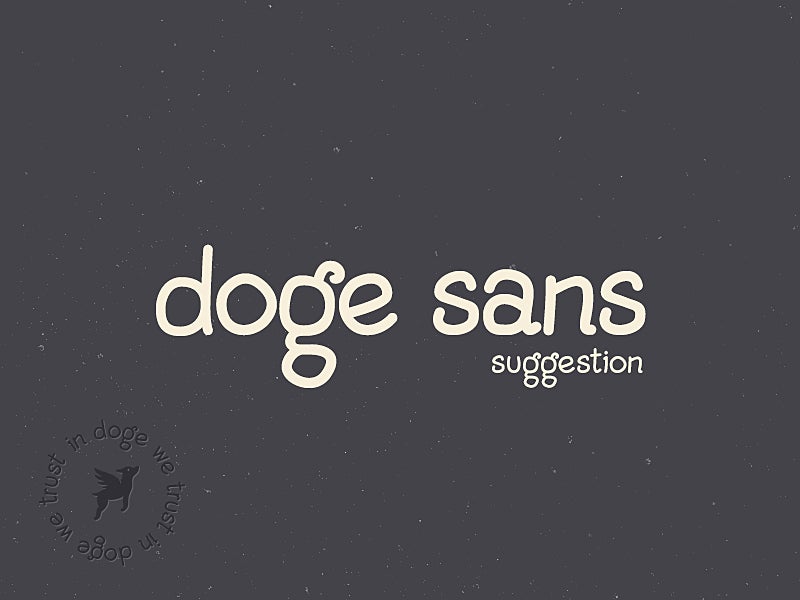
Later, fernozzle was more critical: “Other than simply being an alternative, why is Doge Sans better than Comic Sans? There seem to be a lot of comments here that praise this typeface only because Comic Sans is so reviled. I think Doge Sans may actually be less legible than Comic Sans due to Doge Sans’ relatively closed counters (‘s’, ‘e’), more crowded letterforms (‘g’, ‘a’, ‘n’, ‘t’), and less consistency compared to Comic Sans’ more consistent, rigid style (compare the widths and visual weights of Doge Sans’ ‘s’ and ‘a’, or the x-heights of ‘t’ and ‘o’).”
“I agree,” read the following comment, “if we’re going to make a new font in the name of Comic Sans being horrible, let’s at least make one that’s more legible.” For others, the legibility issue is a trifling one: “Well nobody is planning on writing a book with it, it’s just for logos and saying ‘wow’ and ‘such doge,’” a reasonable person noted. This eventually gave rise to considerable disagreement in the normally feel-good Dogecoin subreddit as to whether or not the currency should embrace changes that make it seem like less of a “joke” and more like a real economy.
Eventually, that argument was diverted into a discussion of copyright: Designer Jord Riekwel showed up in the thread to say that Grazsebastian hadn’t secured permission to use his dog image for the “In Doge We Trust” logo in the lower left corner of the second image above. “I feel like charging people to use a Doge logo is going against the spirit of the shibe,” someone countered, again laying bare the stress fractures that have accompanied Dogecoin’s runaway success. In any case, Riekwel’s dog wasn’t intended to be a Shiba, which caused other people to recommend its removal anyway. (For now, it remains in place, with proper credit given.)
Is Dogecoin getting too big to have a stable identity? Will it inevitably splinter into a hundred competing meme currencies, leaving Dogecoin millionaires high and dry? If it’s this difficult to come to a consensus about style, the very soul of Doge must be at even greater risk.
Photo by pjen/Flickr