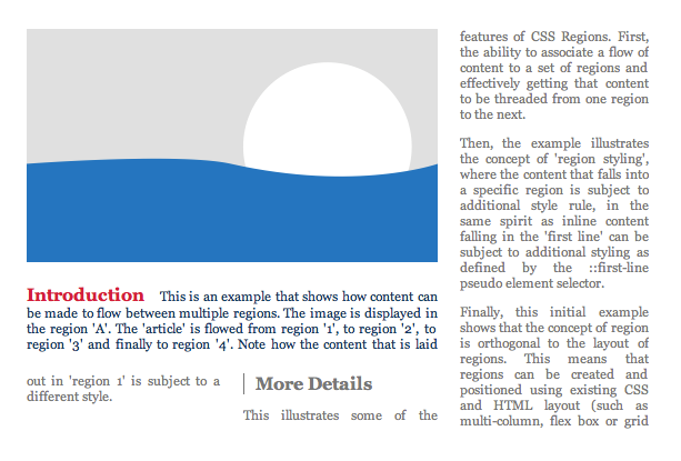
It’s an exciting time to be a designer, especially if you’re the creative type and love to experiment with new techniques. While CSS Regions is still a work in progress, especially since it’s still not supported by all browsers, it’s a powerful layout tool that is worth taking a look at and having a play around with. Regions allows you to use CSS properties to flow content into containers and is ideal for web magazine sites and others that require dynamic text. It can be used to create responsive layouts, perfect for today’s modern web on a variety of devices. First up, a quick look at browser support and enabling Regions. For a full list of supported browsers, see Adobe’s support matrix. In Safari iOS7, Regions are automatically enabled and they are unsupported in Firefox for the time being. In Chrome
- Open a new tab
- Type chrome://flags in the location bar
- Press CTRL+F to open a find box and type in “experimental WebKit features” and hit enter
- Click on Enable > Relaunch Now (at the bottom of the page)
- IE10+ works but requires content to come from an iframe
- Firefox doesn’t work at all as yet
- Safari 6.1 works using -webkit- prefix
- Chrome works using instructions above
- Opera will work if you’re running a webkit-based version with the -webkit prefix
What’s the Point?
The transition from print to web is slowly taking place and this means that publishers have to find new ways to display written content on the web in such a way that has proved tried and tested in print. This has led to Adobe looking at new ways that publishers can create complex layouts so that more sophisticated layouts can somewhat mimic print. The extensions that have been proposed for Regions can be divided into four categories, which are:- Threading content – content that flows from one area into another
- Arbitrarily shaped containers – text in non-rectangular areas
- Arbitrarily shaped exclusions – wrap around text for shapes
- Region styling – style of content dependent on which area it flows into
How Do Regions Work?
Usually, text on a web page can be displayed in various regions, but it is always independent of other text on the page. This can lead to display problems when the site is viewed on different sized devices, which makes it more difficult for the user to navigate, often having to use gestures in order to view text. Using Regions allows you to flow text across different areas of the page into containers using theflow-into and flow-from CSS properties. Note that you’re encouraged to keep semantic content elements separate from presentational ones in which they appear. Once you have added flow-into the content area disappears from view and won’t reappear until the flow-from element is applied.
Defining regions in this way doesn’t affect the underlying content of DOM elements and content flows through the regions logically so you can’t shuffle regions about, they have to be sequential, ie: Region #1, Region #2 and so on. However Regions can be scattered and interrupted by the flow regions of others, but for the most part it’s necessary to rearrange them in the DOM tree in order to modify flow order.
Regions work with the implementation of two simple concepts, the block of content where it can flow-from and a block to flow-into, as demonstrated by the following DOM structure.
<div class="content">Lorem ipsum etc... your content goes here</div>
<div class="myregion" id="region1"></div>
<div class="myregion" id="region2"></div>
<div class="myregion" id="region3"></div>myregion divs into regions; this is also where you control float and width restrictions in order for the lorem ipsum content to flow into three columns.
.content {
  flow-into: yourcontent;
  -webkit-flow-into: yourcontent;
}

.myregion {
  flow-from: yourcontent;
  -webkit-flow-from: yourcontent;

  float: left;
  width: 100px;
}yourcontent as the name for that particular region, you can use different names for different regions to layout separate pieces of content. You can use more regions for numerous reasons, such as:
- More columns
- Positioning
- Fluid layouts
- Large regions below columns
p { color: gray: } @region-style #region_1 { p { color: #0C3D5F; } } (Source: https://www.w3.org/TR/2011/WD-css3-regions-20110609/#region-styling)
As you can see from the example, styling can be used for individual paragraphs and words too, as well as exclusions and SVGs to create simple graphics that can radically alter the appearance on the page.
While this is not an exhaustive introduction by any stretch of the imagination, it should set you firmly on the road to experimentation. You can also try using Adobe Edgeflow, which supports CSS regions and connects directly to Photoshop CC.
Why Use Regions?
Regions are perfect for publishers such as magazines, news sites, online articles or even eBooks looking forward. They are also useful for responsive layouts as the content re-flows as device orientation is changed and so on. With Book.js, a JavaScript library that’s currently experimental, you can even make web pages look like the pages of a book, as it uses regions itself. With tablet devices becoming the norm, regions can be used to make interesting layouts that mimic traditional print and could be just the thing that the publishing industry has been waiting for. So get out there and start experimenting to see what you can create with CSS Regions.Frequently Asked Questions (FAQs) about CSS Regions
What are the benefits of using CSS Regions?
CSS Regions offer a powerful way to control the flow of content in a webpage. They allow you to create complex layouts and designs by enabling content to flow across multiple areas defined in your CSS. This can be particularly useful for responsive design, as it allows for greater flexibility and control over how content is displayed on different screen sizes. Additionally, CSS Regions can help to improve the readability of your code by separating different sections of your layout into distinct regions.
Are CSS Regions supported by all browsers?
As of now, CSS Regions are not universally supported by all browsers. While they are supported by Internet Explorer and Safari, other major browsers like Chrome and Firefox have yet to fully implement this feature. You can check the current level of support for CSS Regions on websites like Can I Use.
How do I define a region in CSS?
To define a region in CSS, you first need to create a container for your content. This can be any HTML element, such as a div or section. You then use the flow-into property to specify which content should flow into this container. For example, you might write: .region { flow-into: myFlow; }.
Can I use CSS Regions with other CSS layout techniques?
Yes, CSS Regions can be used in conjunction with other CSS layout techniques, such as Flexbox and Grid. This allows you to create even more complex and flexible layouts. However, it’s important to note that the interaction between CSS Regions and other layout techniques can sometimes be complex, so it’s worth taking the time to understand how these different techniques work together.
How do I control the flow of content in a CSS Region?
You can control the flow of content in a CSS Region using the flow-from property. This property specifies which flow the content of an element should come from. For example, you might write: .region { flow-from: myFlow; }.
Can I use CSS Regions for print layouts?
Yes, CSS Regions can be very useful for creating print layouts. They allow you to control the flow of content across multiple pages, which can be particularly useful for long documents or books. However, it’s important to note that not all browsers support CSS Regions, so you should always test your layouts thoroughly.
Are there any limitations or drawbacks to using CSS Regions?
While CSS Regions offer a powerful way to control the flow of content, they do have some limitations. For example, they are not fully supported by all browsers, and the interaction with other CSS layout techniques can sometimes be complex. Additionally, CSS Regions can sometimes lead to performance issues, particularly when used with large amounts of content.
How can I test the support for CSS Regions in my browser?
You can test the support for CSS Regions in your browser using websites like Can I Use or by using the @supports rule in your CSS. This rule allows you to specify a block of CSS to be applied only if the browser supports a certain feature.
Can I use CSS Regions in responsive design?
Yes, CSS Regions can be very useful in responsive design. They allow you to control the flow of content across different screen sizes, which can help to ensure that your layouts look good on all devices. However, it’s important to remember that not all browsers support CSS Regions, so you should always test your layouts thoroughly.
How can I learn more about CSS Regions?
There are many resources available online to help you learn more about CSS Regions. Websites like W3Schools and MDN Web Docs offer comprehensive guides and tutorials on CSS Regions, and you can also find many helpful articles and blog posts on the topic. Additionally, you can experiment with CSS Regions in online code editors like CodePen or JSFiddle to get a feel for how they work.
Kerry is a prolific technology writer, covering a range of subjects from design & development, SEO & social, to corporate tech & gadgets. Co-author of SitePoint’s Jump Start HTML5, Kerry also heads up digital content agency markITwrite and is an all-round geek.


