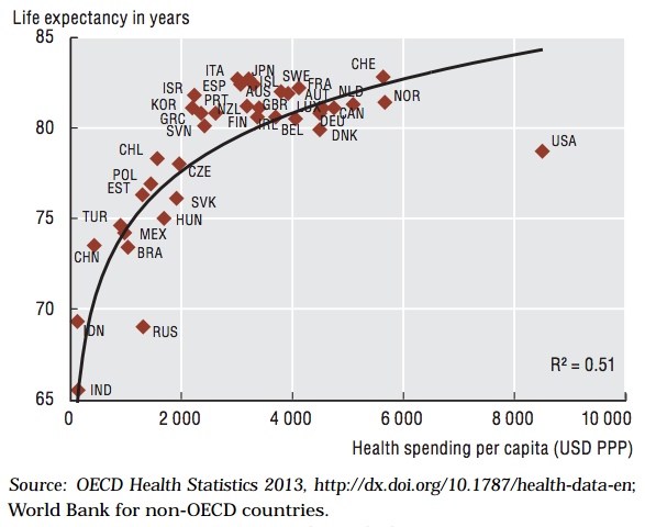
One of the dots on this chart is not like the others.
 Life expectancy at birth and health spending per capita, 2011 (or nearest year)
The chart, from a 2013 report, maps what countries spend per-person on health care against how long people in those countries live. It captures two long-standing truths about the American system: the United States consistently ranks way above peer nations in health care spending, but also ranks way behind in health care outcomes.
In other words, we're not getting what we pay for.
We would expect the United States to spend a bit more on health care. It's a wealthy nation, and as wealth goes up, so does spending on health. But the country isn't just spending more — it's a total outlier, and it's spending more per person than any other nation, while generally insuring fewer people.
Life expectancy is an admittedly crude measure of health; some parts of life expectancy (deaths due to car accidents, for example) won't be fixed by a better health care system. But in a report released today by the Commonwealth Fund, the U.S. came in dead last among 11 developed countries on measures of cost, efficiency, and equity.
It's hard to make the case that there isn't room for improvement.
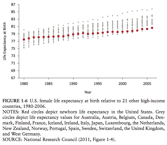
That's especially true when you realize that life expectancy in the U.S. isn't just low; we've been falling behind for years. The chart below is from an Institute of Medicine report titled "Shorter Lives, Poorer Health."

This chart shows how long people expect to live in various high-income nations. The red dot is the United States; the grey dots are everyone else. In 1980, we were firmly in the middle of the pack. But while life expectancy has gone up for everyone over the last few decades, it's gone up more slowly in the United States, and now we lag behind everyone else.
You can slice the data a few different ways, but the news stays bad for the U.S.
We rank poorly if you look at survival until age 50, looking just at deaths among younger adults. And we rank poorly if you look at survival after age 50. We rank poorly if you restrict the analysis to non-Hispanic whites (who, statistically, tend to be in the best health overall). Even if you only look at well-off Americans who aren't obese and don't smoke, they generally experience poorer health compared to their counterparts in other countries.
Despite spending more — much more — than any other nation on health care, Americans often live sicker and die sooner than our international peers. The Affordable Care Act might improve health outcomes by bringing health care within financial reach for people, but there are limits to what insurance can do.