
(T2108 measures the percentage of stocks trading above their respective 40-day moving averages [DMAs]. It helps to identify extremes in market sentiment that are likely to reverse. To learn more about it, see my T2108 Resource Page. You can follow real-time T2108 commentary on twitter using the #T2108 hashtag. T2108-related trades and other trades are posted on twitter using the #120trade hashtag)
T2108 Status: 63.3%
VIX Status: 12.0%
General (Short-term) Trading Call: Hold (Bullish)
Active T2108 periods: Day #299 over 20% (includes day #280 at 20.01%), Day #13 over 40%, Day #11 over 50% (overperiod), Day #38 under 60%, Day #39 under 70%
Reference Charts (click for view of last 6 months from Stockcharts.com):
S&P 500 or SPY
SDS (ProShares UltraShort S&P500)
U.S. Dollar Index (volatility index)
EEM (iShares MSCI Emerging Markets)
VIX (volatility index)
VXX (iPath S&P 500 VIX Short-Term Futures ETN)
EWG (iShares MSCI Germany Index Fund)
CAT (Caterpillar).
Commentary
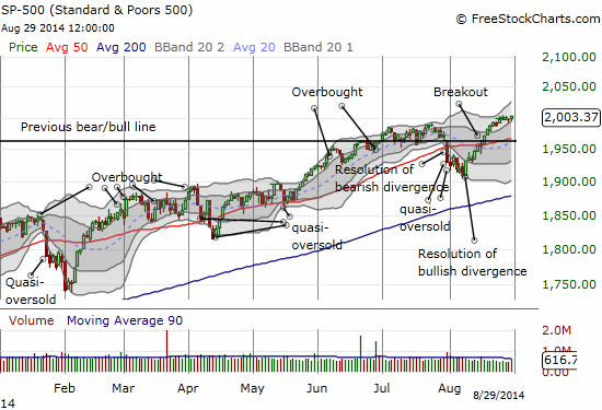
Another day, another all-time high…and a fresh run-up is in sight. In the chart below, notice all the “white space” sitting between the current close at 2003 and the upper-Bollinger Band.
The seasonal weakness never materialized for August in the form of an out-sized drawdown despite the big drop that preceded the month. Instead of a large drawdown, August’s 3.8% gain was its best performance since the year 2000. In 2000, the S&P 500 gained 6.1% in August; the S&P 500 gained 3.4% in August, 2009. Before 2014, August was DOWN three of the last four years. On the flip side, four out of the last five years have delivered UP performances for September. Here is a chart relating August to September performances since 1950.
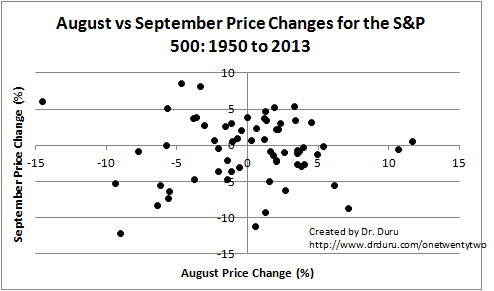
Source for prices: Yahoo! Finance
Notice that there is no apparent pattern or relationship between the performances of the two months. There are some related raw stats of interest from 1950 to 2013 for August and September:
- 35, or 55%, of years August closed with a gain.
- 14, or 40%, of the years with an up August delivered an up September.
- 29, or 45%, of years September closed with a gain.
Given the odds seem to favor a down month for September, I will be very inclined to switch bearish if T2108 hits overbought levels (70% or above). At the current pace, T2108 should hit overbought by the middle of September.
Click image for a larger view…
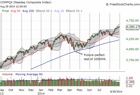
The NASDAQ (QQQ) looks even more bullish than the S&P 500. The tech-laden index bounced liked a springboard off the first Bollinger Band at the lows of the day and closed for a marginal new 14-year high. Unlike the S&P 500, the NASDAQ is already clearly driving higher in an upward channel between the first and second Bollinger Bands. The Bands are wide open for a continuation of the rally.
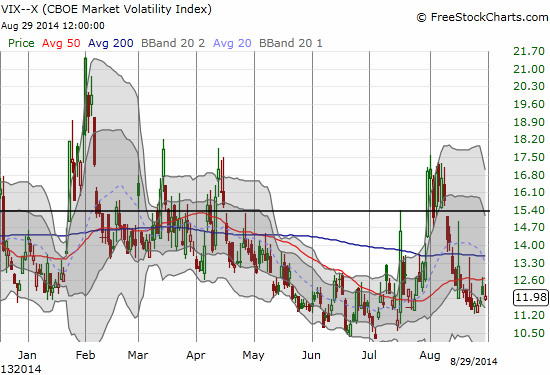
Interestingly, the volatility index, the VIX, avoided making fresh lows. There is no bearish divergence here, just something to watch for now. The VIX could easily plunge if it becomes clear to market participants that the market is going to soar a lot higher.
I end with a fascinating chart a la Twitter (TWTR). The stock is right back at the critical $50 level. Twitter is one of those special cases where analysts stepped up to upgrade the stock right in the middle of what looked like the beginning of the end. Given the general negative sentiment on Twitter, I identified these upgrades as potential markers for a bottom. They were.
Click image for a larger view…
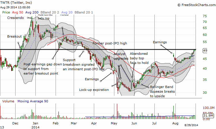
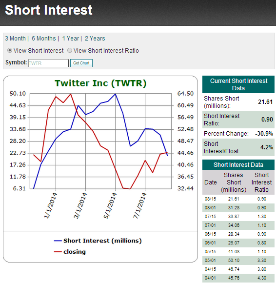
The chart above shows some of the key fundamental and technical milestones for Twitter. If you look very closely, you will see TWTR is trading above a newly formed 200-day moving average (DMA) – a very bullish event. So, I daresay, TWTR will cleave through, likely gap up, over the $50 hurdle. Shorts have already been scrambling to get out of the way of this run-up. Only 4.2% of the float is now short TWTR…
Source: Schaeffer’s Investment Research
Daily T2108 vs the S&P 500
")
Black line: T2108 (measured on the right); Green line: S&P 500 (for comparative purposes)
Red line: T2108 Overbought (70%); Blue line: T2108 Oversold (20%)
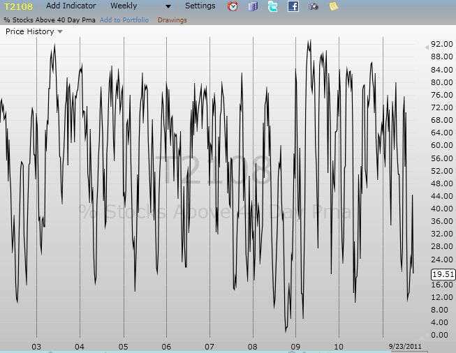
Weekly T2108

*All charts created using freestockcharts.com unless otherwise stated
Related links:
The T2108 Resource Page
Expanded daily chart of T2108 versus the S&P 500
Expanded weekly chart of T2108
Be careful out there!
Full disclosure: