The 17 Designs That Bell Almost Used for the Layout of Telephone Buttons
Among them: "the ten-pin," "the cross," and "the rainbow"
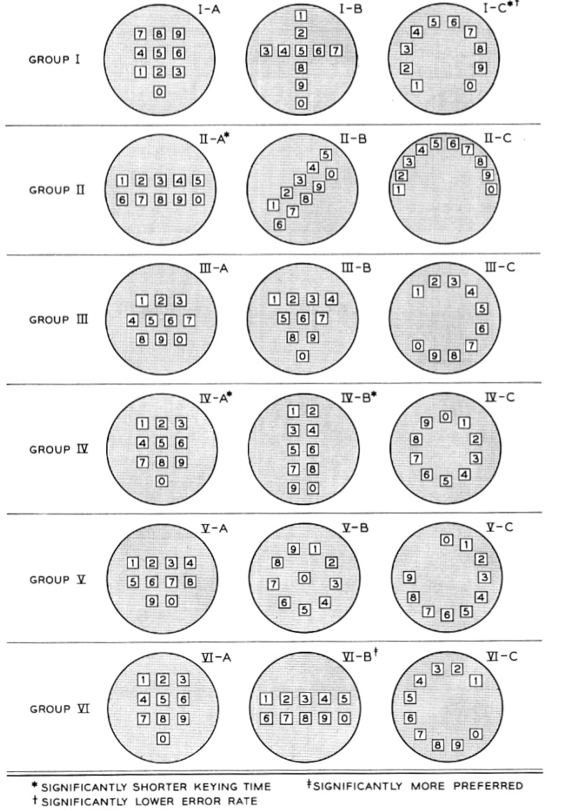
If you look at the number buttons on a phone -- smart, cell, landline, what have you -- those number buttons will feature, almost inevitably, a uniform layout. Ten digits, laid out on a three-by-three grid, with the tenth tacked on on the bottom. The numbers ascending from left to right, and from top to bottom.
This layout is so standardized that we think about it as almost inevitable. But the layout was, in the 1950s, the result of a good deal of strategizing and testing on the part of the people of Bell Labs. And Numberphile has dug up an amazing paper -- published in the July 1960 issue of "The Bell System Technical Journal" -- that details the various alternative designs the Bell engineers considered for the layout. Among them: "the staircase" (II-B in the image above), "the ten-pin" (III-B, reminiscent of bowling-pin configurations), "the rainbow" (II-C), and various other versions that mimicked the circular logic of the existing dialing technology: the rotary.
Everything was on the table for the layout of the ten buttons; the researchers' only objective was to find the configuration that would be as user-friendly, and efficient, as possible. So they ran tests. They experimented. They sought input. They briefly considered a layout that mimicked a cross.
In the end, though, Numberphile's Sarah Wiseman notes, things came down to a run-off between the traditional calculator layout and the telephone layout we know today. And the victory -- the triumph of IV-A -- was a matter of efficiency. "They did compare the telephone layout and the calculator layout," Wiseman says, "and they found the calculator layout was slower."
Via Paleofuture/Gizmodo