


Eye-Catching Islands: 10 Beauties in Blue
Islands in accent colors are all the rage. Here are a few in cool blue

Gone is the unwritten rule that kitchen cabinets need to match. Cladding the island in an interesting accent color is a nice way to break things up. And lately we’ve noticed a bounty of blue islands. This may be due to the soothing qualities of the hue, which we associate with the sea and the sky. In stressful and unsettling times, why not surround ourselves with colors that help us relax and chill out?
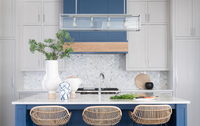
2. A dark blue island works well in any style of kitchen, from super traditional to ultracontemporary. In this transitional kitchen, the deep blue base serves as an excellent contrast to the white marble top, allowing the latter to really stand out. On a white cabinet base, the marble wouldn’t have as much prominence.
3. When selecting lighter blues for a kitchen, I gravitate toward tints that have some complexity, with green, purple or gray undertones. They keep the blue from looking too pastel and as if it belongs in a nursery.
This blue is on the softer side but is in no way a baby blue. It appears to contain purple and gray, which give it a more grown-up and elegant look.
This blue is on the softer side but is in no way a baby blue. It appears to contain purple and gray, which give it a more grown-up and elegant look.
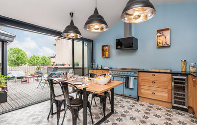
4. Here’s another soft blue. The addition of a bit of green gives it a soothing, watery quality that, to me anyway, brings a relaxed, beachy feel to the kitchen.
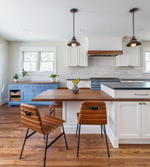
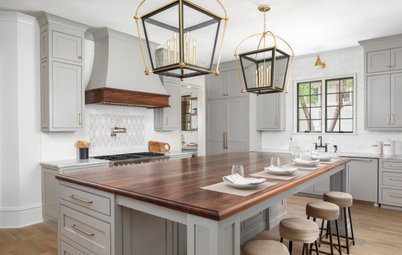
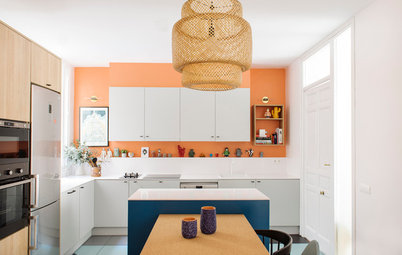
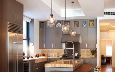
5. A deep blue accent color pairs nicely with wood tones. In fact, the easiest way to make beautiful wood elements stand out is to contrast them with blue, as blue and orange (a common tone of natural wood) are complementary colors, meaning they offer the most contrast when used together.
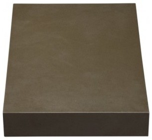
Island paint: Dark Pewter, Benjamin Moore
Island paint: Dark Pewter, Benjamin Moore
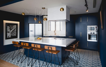
6. This mostly white kitchen gets a dramatic contrasting punch of color via the navy blue on the island. Keep in mind that dark, cool colors tend to make objects appear smaller than they are. So it’s a great choice on a larger island to help visually scale it down a bit.
7. Blue needn’t be limited to the island alone. Think about spreading that color love elsewhere in the space, especially if using a neutral or light blue. This grayish-blue island gets reinforcement from the kiss of blue on the stools.
8. Here, the soft blue-green island color is picked up in the pendant lights above, the striking backsplash and the decorative tableware. It’s a nice trick for creating a colorful space that remains relaxed and harmonious.
10. I love this delightful kitchen’s mix of traditional and modern elements, such as the gorgeous crown molding and inset cabinet doors versus the smooth glass backsplash and stainless steel appliances. But for me, the centerpiece is the island, the ideal place to sit and enjoy a glass of wine in front of a roaring fire. The soft watery blue sets it apart from the main bank of cabinets, and echoes the backsplash color.
Your turn: Do you have a blue-clad island? Share a photo in the Comments section below.
More
How Much Room Do You Need for a Kitchen Island?
Kitchen of the Week: We Can’t Stop Staring at This Bright Blue Island
Your turn: Do you have a blue-clad island? Share a photo in the Comments section below.
More
How Much Room Do You Need for a Kitchen Island?
Kitchen of the Week: We Can’t Stop Staring at This Bright Blue Island
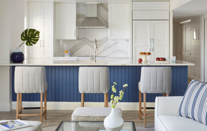


The blue on this island reminds me of slightly faded denim jeans, so it has a nice casual appeal. It’s bold enough to make the island the center stage in this charming kitchen but still retains an understated and relaxed vibe.