


Design Feature #41
Hanzi
Kan Tai-keung (Hong Kong)
Text by Kan Tai-keung
Human communication gave birth to languages and words. People of different ethnics, living in different times and spaces, speak different languages and write different words. Most written words are symbols created to represent sounds. Developed since over 4,000 years ago in China, hanzi is one of the very few words created with strokes and to represent shapes and sounds. It is unique and vivid.
While the evolution of hanzi has a very long history, it is still used by different populations today, displaying a strong vitality. It is not just a living tool, but an art form.Seal carving, calligraphy, character and font design…Each of them is a creative field.
From the late last century to the early millennium, Chinese contemporary design was blooming, leading the thriving of hanzi in the field of graphic design. Hanzi design works by different designers were frequently showcased and awarded in the international arena, setting a new trend and opening a new chapter for the hanzi arts. Over the last decade, more and more art and design events took hanzi as the theme, and hanzi has also earned a growing number of followers, especially among the young generation. We are really happy to see that.
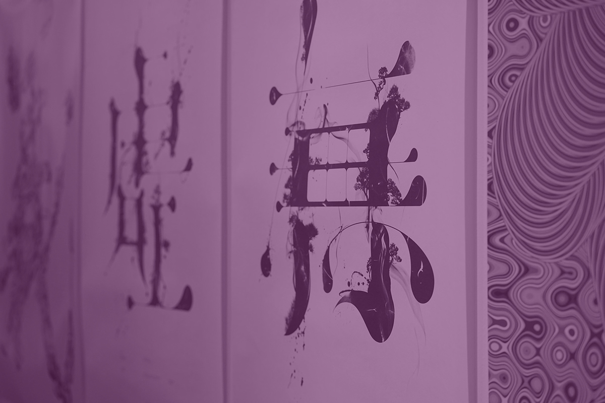
In my design and art career, hanzi has always been one of the key elements. Since I joined the design industry, I already realised the importance of hanzi in the Chinese society that we were living in. No matter in the commercial world or daily life, hanzi is something you can’t live without. That prompted me to explore the design and possibilities of hanzi.
In my early works, hanzi mainly appeared in one single colour or solid black ink. For instance, in the Poster of Graphic Design Course by Studio II, I simply features two Chinese fonts – one is the Chinese character “集” (gather) in Song font drawn with ruling pen, the other is the Chinese character “一” (one) written with Chinese ink brush – to convey the education vision of integrating the styles and techniques of modern and traditional, as well as East and West.
Later, my style in creations, such as Passion for Words - Mountain, Water, Wind, Cloud, gradually evolved by featuring various fonts such as seal script, cursive script and logographic writing, coupled with thick and thin ink, to achieve different artistic conceptions and ideas. In the process of studying and practicing shan shui (landscape) painting in recent years, I was inspired to apply abstract brushstrokes to transform hanzi to shan shui paintings and created a series of conceptual works. In works such as Mountains & Beyond and X Beyonds O Series - “Mountain in Mind, Water in Mind”, hanzi is illustrated as if shan shui paintings to express different ideas and depth of concept. I’ve also tried to handle other languages as if hanzi or combine hanzi with modern symbols, hoping to break through and expand hanzi’s possibilities. With our collective efforts, may a new era of hanzi design begins.