
- The Ubiquitous Carousel
- Greatest Benefits of Carousels
- Greatest Drawbacks of Carousels
- Could a Hero Image Be Your Site’s Hero? Consider Using a Hero Image Instead of a Carousel
- Guidelines for Good Carousel Design
- Auto-Forwarding
- Auto-Forwarding Tips
- Static (Non-Auto-Forwarding) Carousel Tips
- Conclusion
The Ubiquitous Carousel
But the most ubiquitous type is the feature area carousel (as discussed in this article), which usually possesses the following traits:
- appears toward the top of the homepage
- occupies a substantial section of the “above fold” area
- displays more than one piece of content in the same place (one at a time)
- offers some indication (or navigation) that there is more than one piece of featured content, or frame, within the carousel
- contains images and a small amount of text in each frame
- includes content about the organization’s brand or mission, featured information, or
- consists of promotions.
Greatest Benefits of Carousels
The greatest benefit of using carousels is that they enable more than one piece of content to occupy the same piece of prime real estate on the homepage, which can help diffuse any infighting about whose content is most deserving. An additional benefit is that because more information appears near the top of the viewable area, there may be greater opportunity for people to actually see it.
Greatest Drawbacks of Carousels
You can’t count on people seeing the information in carousels on websites and intranets. Whether looking at content on a 30-inch or 3-inch display, people often immediately scroll past these large images and miss all of the content within them, or at least the content that’s in any frame other than the first. It is true that some eyetracking research and web metrics show that certain carousels garner a number of fixations and clicks. But the most important caution about using carousels is that people frequently overlook them, together with all or some of the content within them.
The second most important caution relates to the idea that a designer considers the carousel as a collection of images, but a user often considers just the one image he sees. A set of images in a carousel may collectively give an accurate impression of what an organization does. But if a person sees only one image in that set he may get the wrong idea about an organization. This problem occurs frequently when an image depicts something outrageous, or simply not highly-related to the business or charter.
Could a Hero Image Be Your Site’s Hero? Consider Using a Hero Image Instead of a Carousel
Today’s multi-image carousels replace the static, single “hero images” that used to be plastered all over the web. But in some cases the mature UI alternative may be a better fit than its youthful, energetic descendant. One reason for this is the designer’s attitude. Knowing there are multiple alternative frames in a carousel that have the opportunity to get a point across or capture the user’s attention may give designers a false sense of security. They assume that people will see all of the images offered in the carousel, so they may choose meager images in the hopes of making up any issues in volume. But if designers knew they had to choose just one image and a sentiment for it, they may be more likely to choose something that’s powerful and demonstrative. And users could really focus on that one image rather than dividing their attention among several. Additionally, a static hero image may be less likely to distract users than a rotating element, and thus may increase the visibility of global navigation that people can use to discover other areas of the site. (Incidentally, it’s always a good idea to put any important information that appears in a hero or carousel also somewhere else in the UI, so the people who interact with the IA and pages have a fighting chance of seeing it.)

Several things make the content of Best Buy's hero effective, including:
- The images of the television, laptop, and refrigerator are easily decipherable and show the variety of products on sale. This hero is attention-grabbing, communicative, and information-rich.
- The typeface and colors match those used in the global navigation and masthead, so the hero appears to be part of the site content rather than a pushy advertisement.
Additionally, these traits help convey the Best Buy brand, and reinforce communicating the products they sell every day.
Guidelines for Good Carousel Design
But if you decide the carousel is your superman after all, follow these guidelines for doing them well.
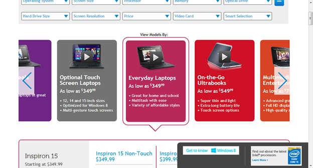
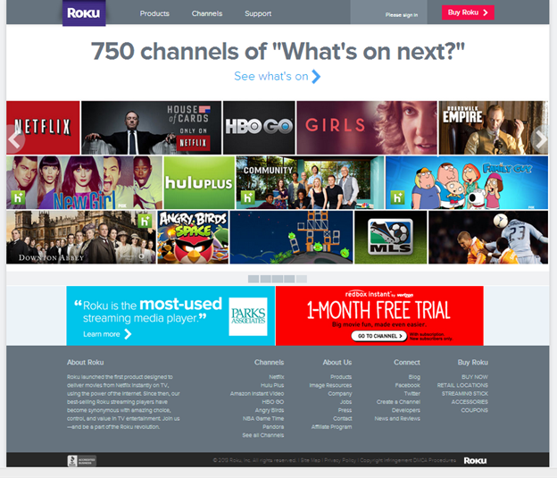
1. Include 5 or fewer frames within the carousel, as it’s unlikely users will engage with more than that.
It can be taxing to swipe through many frames on a mobile device, and it’s difficult for users to recognize topics they have already viewed when a set exceeds about five. Limiting the number also helps with discovering the content, and finding the content in the carousel again later.
2. Use crisp-looking text and images that coincide with the organization's charter.
It’s difficult to read small text and decipher small images, especially on mobile devices. And it’s never any good to cram a large, high-density image into a small region. The clearer the text and images, the more likely users are to engage and understand the intended points.

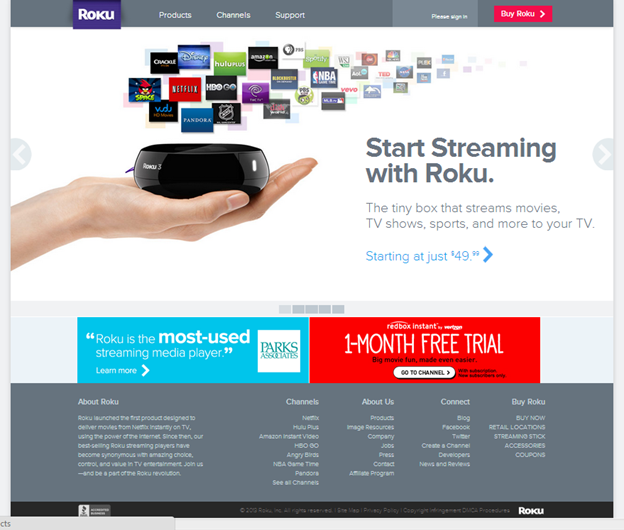
3. Indicate how many frames are present and where the user is within the progression, to help people feel in control.

4. Use icons and links that are understandable and recognizable.
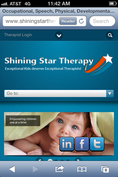
In navigation controls, aim to help people identify the choices, and recall them after they have already seen the content in the main frame. A user cannot guess what a number or dot might reveal when clicked, but may remember that a green background relates to an article about the environment, for example. Dots are a particularly poor cue on mobile devices, because people often do not notice them (and they are less standard in Android than iOS).
5. Ensure that navigation controls appear inside the carousel, not below it or separated by a fold.
This design practice helps avoid issues on both large and small displays.

6. If offering a navigation button for each frame (rather than arrows to scroll through), ensure that each button looks different, and represents the frame.
John Deere’s homepage offers images with text as buttons, and they appear within the carousel, which is all helpful. (It also has arrows to forward and rewind the carousel.) However, the text is very small and difficult to read, and the images used as buttons are too dense for the small space allocated to them.


7. Make links and buttons large enough to decipher and click.
Buttons that are tiny, close together, or on top of a busy background are not easy to notice or click.
Auto-Forwarding
Auto-forwarding through the frames in a carousel leads people through the information. But there are some instances where auto-forwarding is not recommended.
Do not auto-forward if:
- You are not sure you can get the timing right, so that most people read and absorb the content within the time specified. Sometimes carousels move too quickly, and users can’t read the information, which is frustrating for them and not good for the organization trying to make a point. Sometimes carousels move too slowly, so when they do animate, it is surprising to the user.
- Your content resembles advertisements. Users are more likely to ignore an animated item that looks like an ad (if they are not in a shopping mindset). Our eyetracking research reveals that animated ads get looked at 27% of the time.
Auto-Forwarding Tips
- Do not auto-forward on mobile devices, because: (1) it slows down the page, and (2) because pages are short, users often scroll quickly, so by the time the carousel changes, the user is likely looking below the fold and won’t see the change anyway.
- Test for the right timing, or at least estimate how long it might take the average user to read the text and process the images. We use 3 words per second as a guideline.
- Don’t stop at the last frame. Continue cycling through the frames (and displaying which frame is selected).
Static (Non-Auto-Forwarding) Carousel Tips
Ensure that users interested in a carousel realize that there is more than just the currently displayed image/content. Offer clear visual elements that represent the notion of more content, such as:
- navigation links and icons (as noted above)
- cutting off, or “bleeding” an image and displaying part of the next image.
Conclusion
If you are using a carousel in the hope that people will see a variety of content, know that some people will only see the first frame or none at all. So ensure that important content is also placed mindfully in the IA and on another page of your site. Consider using a static carousel or hero image instead of a rotating one. And in any carousel’s navigation, ensure the buttons and links are clear, large enough to decipher and click, and the selected frame's button appears selected. That way, you’ll create a fanciful amusement, not a house of horrors.


