
Pelikan M805 Stresemann
Fountain Pen Review
– Handwritten Review –
- Review Ink: Sailor Jentle Miruai (Seaweed Indigo)
- Review Paper: Clairefontaine Classic Notebook
Specs:
- Description: A premium, piston filling fountain pen in black and grey from one of Germany’s most-respected brands.
- Nib: Broad, 18k gold, rhodium plated
- Filling Mechanism: Piston with brass components
- Weight: 28g
- Measurements: 5.25″ overall, 6.625″ posted, 0.625″ diameter
- Color Options: Black with striped anthracite grey barrel, rhodium trim
Handwritten Review Scans:


Intro/About:

I used to have a Pelikan M605 that I got rid of because it wasn’t seeing as much use as I would have liked. As soon as I saw the announcement of the Stresemann, I knew I had to once again add a a Pelikan to the flock. The M805 Stresemann is an anthracite grey striated M805 with silver trim and an entirely rhodium-plated nib. The M8XX series is Pelikan’s second largest pen, right under the M1000 and right above the M600. The size and weight are ideal for me. Many thanks to Ron over at Pen Chalet for sponsoring this review! Read on to see how the M805 held up to regular use!
Make sure to check out the gallery at the bottom of the review, featuring 20 full-sized photos of the Pelikan M805 Stresemann!
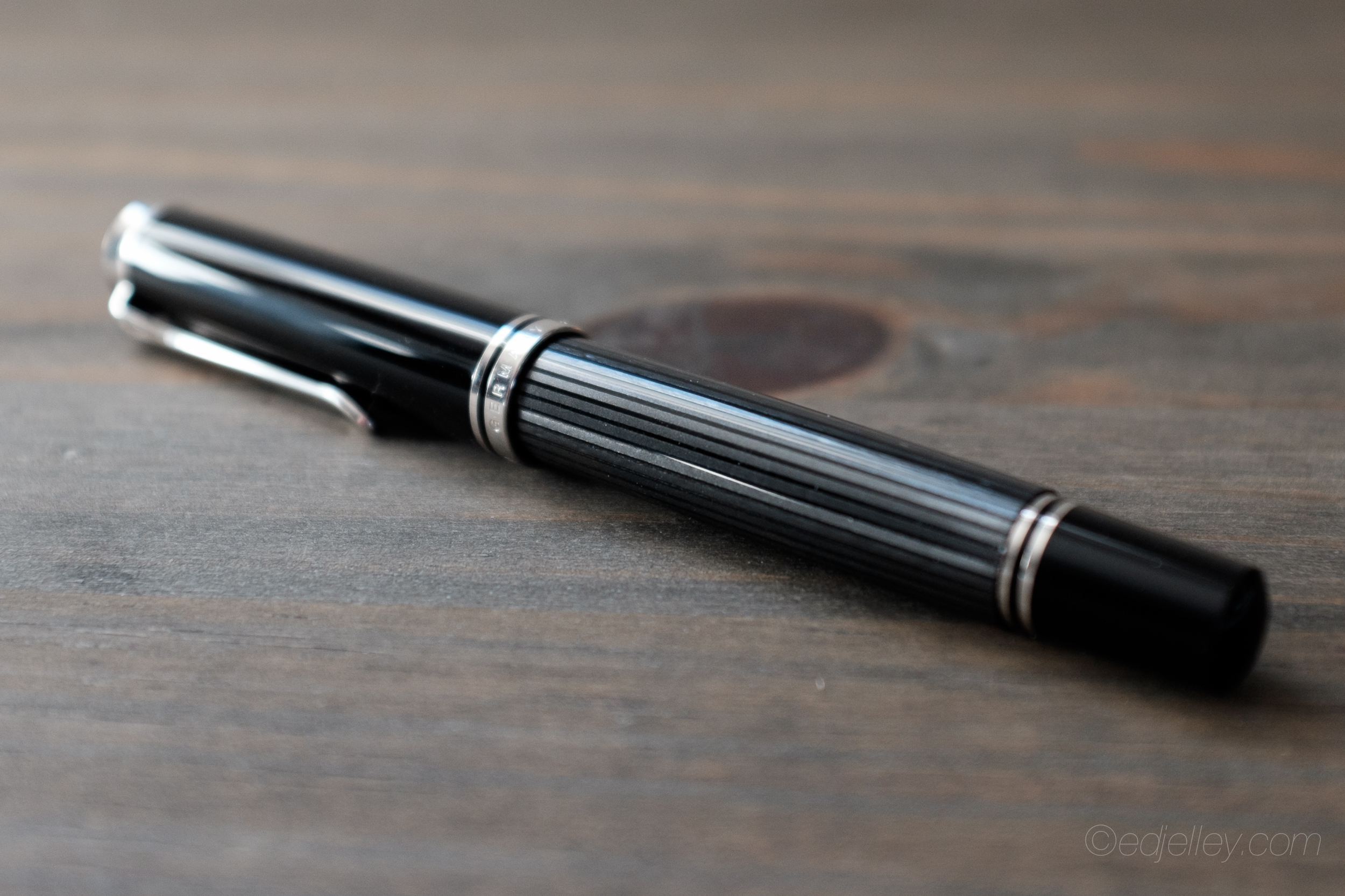
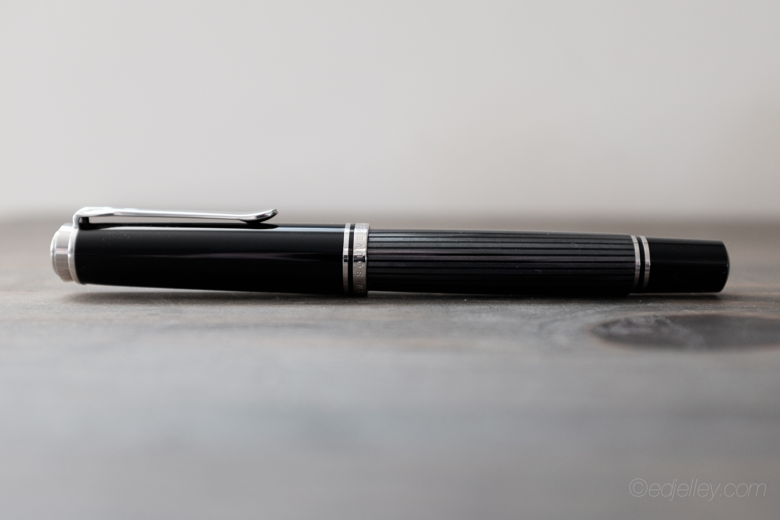
Appearance & Packaging:
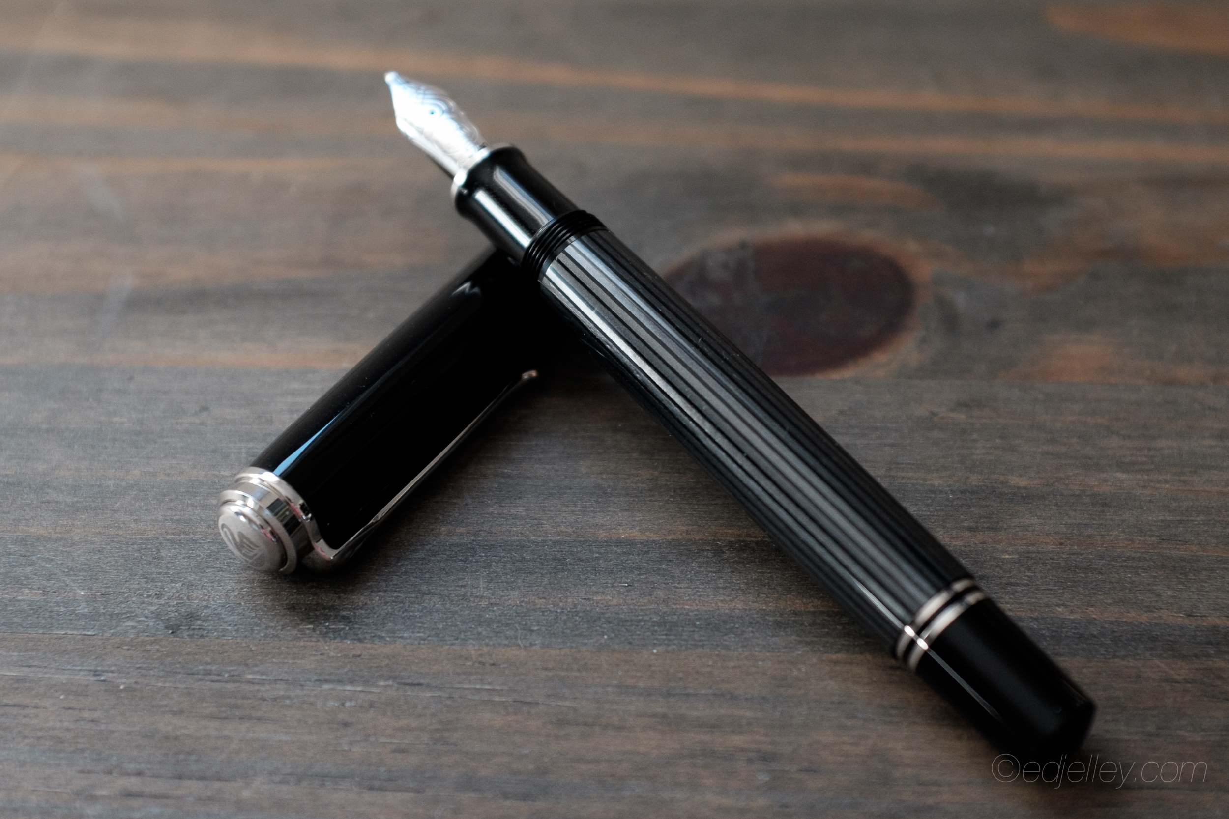
The Stresemann comes in the standard Pelikan packaging. A faux wood and white box. Inside is a nice leather pouch, held closed by an elastic band bearing a plastic Pelikan logo emblem. Packaging doesn’t mean a whole lot to be, but the Stresemann is nicely presented. Inside the box is what really matters. The pen is absolutely stunning. The grey striated barrel has a deep shine and is transparent between the stripes. This allows you to see the ink level remaining.
 Since the ink level is visible through the body, there is no need for Pelikan’s signature green ink window on the black pen bodies.The lack of ink window streamlines the body and results in a cleaner look overall. The pen is large, and posting the cap makes the pen larger. Usually Pelikan uses a dual-tone nib, but the Stresemann is unique in that they have implemented an entirely silver, rhodium-plated nib. The large size nib looks wonderful and matches the aesthetic of the pen perfectly. I love the shape of Pelikan nibs and it is accented in this larger pen. The silver trim nicely compliments the grey body and silver nib on the pen.
Nib Performance & Filling System:

I opted for a broad nib, which is quite out of character for me. Admittedly, the tines were ever-so-slightly misaligned out of the box. A quick adjustment and everything was fine. The nib is super smooth and in the middle of the wetness scale. The broad nib is a bit narrower than the Lamy 2000 broad nib I also recently picked up. I’m happy with it, but I’d prefer a bit more ink flow.

The M805 employs a massive piston filler. Ink capacity is great, especially given the amount of ink a broad nib goes through. The piston is buttery smooth and there’s no play in the knob. The brass components inside add some heft to the pen, but it stays balanced. Unscrew the knob, submerge the nib, screw the knob back in, and you’re ready to write. No complaints here!
Feel:
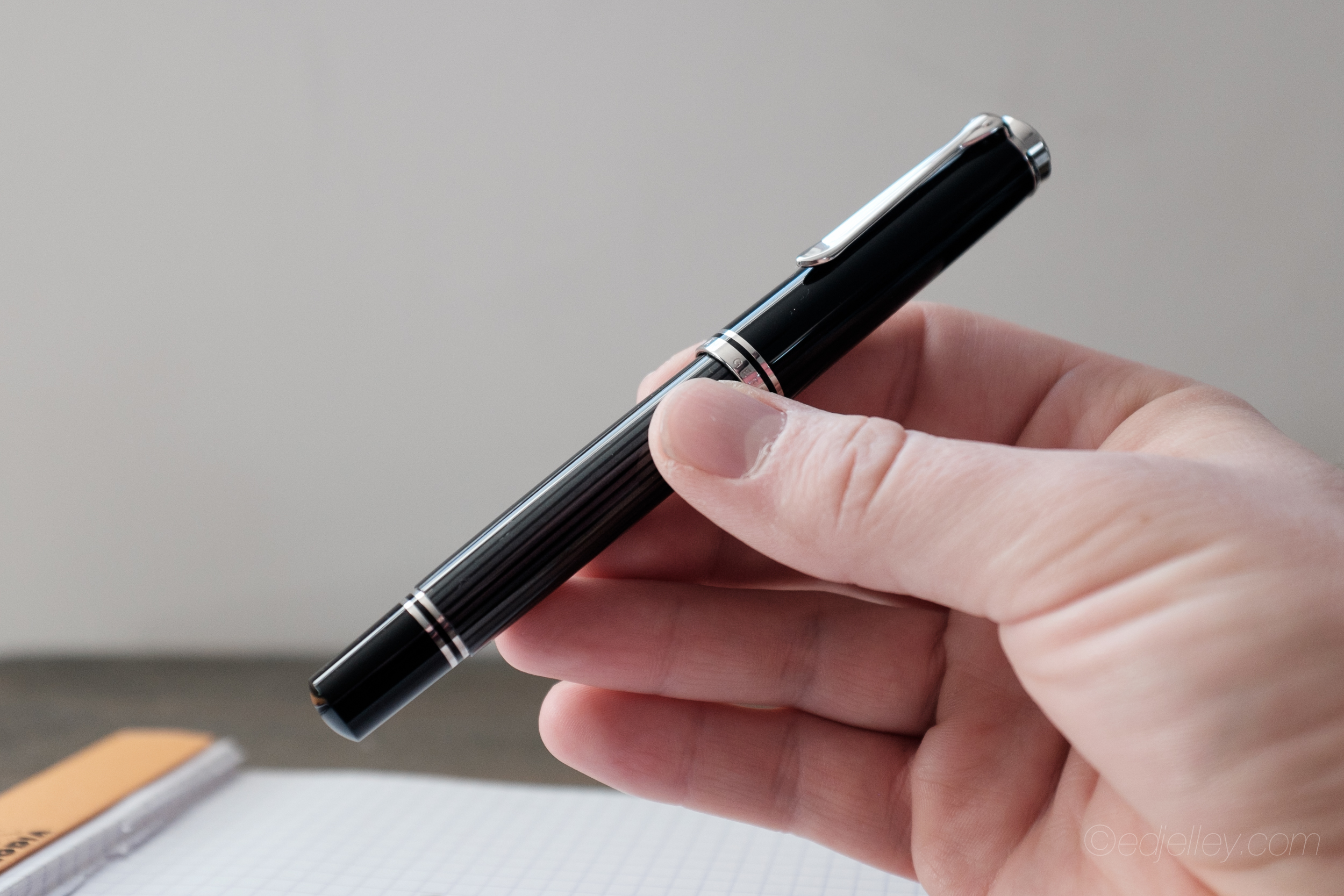
The M805 isn’t nearly as heavy as I was expecting it to be. For some reason, I had it in my head that this thing was going to weigh me down. It’s quite comfortable in hand, especially when writing with the cap off, unposted. Posting the cap makes the pen a bit unwieldy. The added length and weight towards the back are not the best for my hand / writing style, but for those with larger hands it just might be.

The body of the pen is smooth and without faults. The resin is particularly sleek to the touch. Be careful, as the black is particularly prone to micro scratches. The cap threads are small and unobtrusive, meaning that those who grip higher up on the pen shouldn’t be bothered. The width of the grip section is very comfortable and the gentle taper keeps inky fingers at bay. For long writing sessions, I’ve found no fatigue or cramping due to the shape and weight of the pen.
Pros:
– Looks extremely classy
– Broad nib is silky smooth
– Weight, balance and shape are comfortable in hand
Cons:
– Nib tines were slightly misaligned out of the box
Conclusion:
 At around $640, the Stresemann is most certainly a luxury. It performs well, and the price isn’t simply just for the brand. The components and construction match up to the price tag and it will last a lifetime. Pelikan is a highly-regarded brand and there is tons of heritage and history behind this M805. This pen is not an impulse buy for most, but if you’re in the market for a Pelikan, the Stresemann should definitely be considered!
Check out Pen Chalet for pricing and options on the Pelikan M805 Stresemann.
Gallery:


Nice review. I bought a medium-nibbed Stresemann recently, and my tines were quite mis-aligned as well and the pen could hardly lay down a line it was so scratchy. I ended up having to bring it to a nibmeister guy to get them aligned and smoothed–now it writes beautifully smooth. Love the pen. I too was surprised how light it was! Makes for less fatigue though, so I’m not complaining.
Thank you!
That’s pretty disappointing to hear. I just used my fingernail and bent it slightly back into alignment, but I can totally see how those who don’t feel comfortable doing so would be wary of trying on a $640 pen… At least it’s working now!
Beautiful photos as always! That looks absolutely stunning pen. The color combo appeals to me a lot. Sadly, as a broke college student, I can only dream of getting one. Maybe I can sell the idea to my parents as a b’day gift. Hahaha.
Small Correction: Underneath “Handwritten Review”, the ink is specifid as “J. Herbin Orange Indien”, however, in the pictures it’s stated to be Sailor Miruai.
Thank you! Hopefully you can drop the hint!
It totally is Miruai, I formatted two reviews at the same time and the other one was the Herbin ink. Too much typing in a row!
I prefer the traditional green Stresemann stripes of the M800 (although I suppose the anthracite stripes are more authentic to the striped pants Gustav Stresemann wore), and I have a 1950s vintage Pelikan fountain pen from my grandfather of the same.
One point to keep in mind is the Pelikan Souverän fountain pen nibs are interchangeable, so if you tire of the B, you can order a BB, or an OBB, and end up with a whole new pen for just the cost of a nib unit, which is around $180 or so.
Hello Ed
Thanks for an extremely useful and thoughtful article (and webpage). Are you able to say anything about the leather pen-case in the photograph?
That is a pen sleeve by One Star Leather Goods. They make excellent stuff. Great quality leather and craftsmanship.
Ah Ed, making me drool again. Luckily my M800 hungers have already been satiated this month by a lucky find at a UK pen show of a first year standard black finish with a glorious 14C 3B nib. The Stresemann is still on my wish list though. Great photography as usual sir.
what a beauty. i’ve been wanting one ever since i first saw the ad for the pen. when i finally got a chance to see one up close at a pen shop, unfortunately it’s heftier than what i’m used to for long writings. plus, the steep price. sigh…