
Last week, OCHA (United Nations Office for the Coordination of Humanitarian Affairs) published their “Gaza Crisis Atlas“.
It is a 100-page long, ready-for-print, PDF atlas of Gaza, showing the locations of schools, shelters, hospitals and other infrastructure, along with more than 12,000 points representing damage and destruction caused by the IDF air and ground assault during the first month of Operation Protective Edge (between July 9th and August 5th).
The Gaza Crisis Atlas is a planning tool intended to assist aid and development agencies in assessing and responding to humanitarian and reconstruction needs emanating from the conflict in the Gaza Strip. It is a vital tool for humanitarian and development organizations, but it is also a valuable resource for anyone operating in Gaza as well as those wanting to better understand the impact of the recent escalation of hostilities.
The Atlas includes printable A3-size maps featuring satellite images of all areas of the Gaza Strip. The main features / land marks were plotted on a high resolution satellite image captured on 6 July 2014. The Atlas was designed at the neighbourhood level to provide higher level of detail to support operational organizations to conduct needs assessments and programming. The individual subset maps illustrate physical damages provided by UNOSAT based on analysis of satellite images from 14 August 2014. Location of shelters, health and education facilities in addition to other baseline information is all mapped.
I cannot independently verify the veracity of the damage reports and locations, or the methodology used by OCHA in collecting and classifying these sites. From going over these locations with satellite imagery, they are indeed overlapping structures and other compounds.
OCHA defined 4 qualitative severity levels
- Crater/Impact
- Moderately Damaged Structure
- Severely Damaged Structure
- Destroyed structure
Their maps are colour coded, and I’ve used this same symbology for my maps

It should be noted that these maps had a separate symbol for damaged hospitals and power stations, yet didn’t actually have a damage point on top of it. I’ve saved these with threat level “zero.”
I extracted the points and uploaded them in this easy to navigate Google Fusion Tables map, displayed by severity.
Here are those points extracted by severity (increasing from 0 & 1 on the left to level 4 on the right):
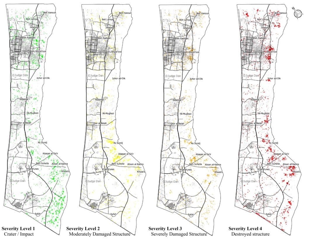
Several patterns are discernible:
The attacks are in no way “random” or “indiscriminate”. One can clearly see the spatial distribution of the damage in several aspects. We find 8,952 of the 12,433 total points (72%) are within a 3 KM buffer abutting the border with Israel. The main objective of Operation Protective Edge was to find and destroy dozens of terror tunnels dug from Gaza into Israel.
That the most intensive damage was caused to the area where the tunnels naturally originated is thus perfectly understandable. Furthermore, of the 4,441 destroyed structures, 3,481 of them (78%) are within the 3 KM buffer, as are 2,531 of 3,303 (77%) of the lowest intensity damage (simple craters), which are mostly strikes on rocket launchers and tunnels.
Most of the attacks are grouped around certain neighborhoods or villages, such as Shuja’iyya, Johur ad-Dik, Sureij, and Khuza’a. These were probably the result of the ground operations that took place in dense urban areas also within the 3 KM buffer that housed multiple tunnel entrances and shafts, as well as launch sites for mortars and rockets.
The IDF has published a map of known terrorist infrastructure in the neighborhood of Shuja’iyya. By overlaying the the IDF’s map with OCHA’s damage points, the correlation is uncanny. Furthermore, note how most of the strikes on farmlands are indeed classified as “Crater/Impact”.

Of the places that were attacked outside of the 3 KM buffer there are two of note. The primary one is the Philadelphi corridor that separates the Gaza Strip from Egypt (under which run many smuggling tunnels). Additionally, there is the southern Gaza city neighborhood of al-Zeitun, which was just recently used as the launching site of the mortar that killed 4 year old Daniel Targeman.
OCHA is focusing mainly on the civilian aspect, and has thus divided and analyzed the damage based on the 5 Gaza governorates and their subdivisions, tallying the data in several tables in the report. This analysis is missing the “big picture”, the overall intensity of the strikes.
Damage Intensity Heatmap
This heatmap was created with a weighted kernel density of the OCHA damage points, with the weight being the severity.
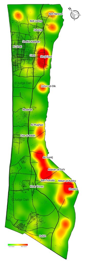
It now becomes very clear that most of the damage was caused to 5 locations right on the border with Israel. The rest of the Gaza Strip was, for the most part, undamaged. The main population areas of Gaza city, Jabaliya, Khan Yunes, Rafah and Deir el-Balah were disproportionately undamaged.
If we do a rough estimate of the damage area, it is once again clear the vast majority of the Gaza Strip was unscathed. With a fairly generous estimation that a damage point has a 25 meter radius – the footprint of a house, or the blast radius of a bomb – the total damage area of the 12,433 impacts was in the order of 15 KM2. The land area of the Gaza strip is 360 Km2. In other words, less than 5% of the land was affected.
One last point which should be noted: with roughly 15% of Hamas rockets and mortars falling short or misfired, it is safe to assume that a significant number of those damage points were not the result of Israeli air strikes, shelling, or detonations. This is not mentioned in the OCHA report.
In conclusion, in this post I tried to show some absolute data and geographical information beyond the online and printed hyperbole that we have seen in the past several weeks. While it is indeed upsetting that many uninvolved have been killed, the lopsided portrayal of the “IDF attacks on Gaza” is disingenuous. Israel has said from the get-go that it is targeting terrorists, and the spatial distribution of the damage points (from this third party source) proves the IDF’s claims of targeted attacks on terrorist infrastructure, whether they are in fields or in the middle of a neighborhood hijacked by Hamas.
I am more than willing to continue analyzing and investigating the OCHA dataset and am open to suggestions and remarks from others. I am sharing CSV with the full list of 12433 geocoded points in WGS84 D.d format including their severity level and the page they appeared on for easy indexing, and WKT Geometry field.
Disclaimers:
OCHA damage data, while not published in itself, is considered public domain and as such can be subject to fair use.
All other geographic data: roads, buildings, outlines and places are OSM data.
The Damage Intensity map is copyrighted and watermarked. You can share it with proper attribution to my post here at Israellycool with a link back to this post. If you would like further comment or to republish this work please contact judgedan48 [at] gmail.com
Update by Brian of London:
A quick note about Dan’s very pretty “Damage Intensity Heatmap”. This map is simultaneously excellent for showing a big picture yet somewhat exaggerating the actual damage that occurs. It is very important to view this heatmap alongside the fine detail map provided just above (the one with 4 separate images).
Dan’s “weighted kernel density” map is a way of taking those four maps and combining them into one.
It should not, under any circumstances, be regarded as showing that areas shown in the “hottest” colours suffered total devastation. Each strike is still pin point in nature.
In making his map Dan assumed each strike caused damage in a circle 50m across (25m radius). It is highly unlikely all these strikes caused that amount of damage. Even the recent destruction of multi story buildings in Gaza (videos here) probably only measure 50m across. This number is necessary to get a smooth coloured map even if it indicates damage where there really wasn’t any.
A kernel density is a way to calculate the density of an element in a continuous way. This takes into consideration the total area of an element’s affect is not equal, and is more dominant close to the origin, and dissipates the farther away you go. The results are a much smoother and good looking density map. The weighted part is just a way to give extra emphasis for higher ranking points.
Update: A follow-up analysis post can be found here.
The heat map is the work of a genius!
Hit map 🙂
Re blogged here
http://warsclerotic.wordpress.com/
Re blogged it here ( Dutch site )
http://www.de-stek.info/forum2/index.php?topic=22031.new#new
and
http://ejbron.wordpress.com/2014/08/24/de-islamitische-kolonisten-vergeten-feiten-over-het-arabisch-israelische-conflict/
Hamas governs Gaza and is responsible for the safety of its citizens.
Truly excellent work. Will it change anyone’s hating mind about Israel? Maybe… now that so much more terrorism is occurring all around us.
Gaza Crisis Atlas 2014 what an amazing setelite photos!! a Very High Resolution Satellite Imagery