Man Without Fear: David Mack, Daredevil, and the Bounds of Difference (Part Two)
/This is part two of a four part series exploring how David Mack's visual style challenges the conventions of the superhero comic.
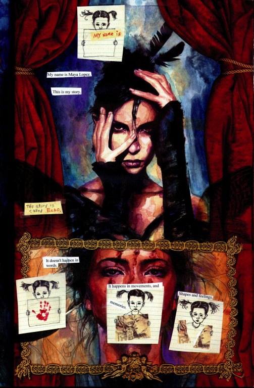
Mack helped to introduce Echo (Maya Lopez) as a character in Parts of a Hole. Her backstory is classic superhero comics stuff. Here's how her backstory gets described in the Marvel Universe Character Wiki:
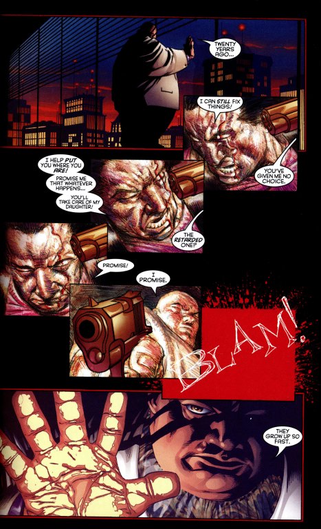
When she was a small girl, Maya Lopez's father, a Cheyenne gangster, was killed by his partner in crime, the Kingpin. The last wish of her father was that Fisk raise the child well, a wish the Kingpin honored, caring for her as if she was his own. Believed to be mentally handicapped, Maya was sent to an expensive school for people with learning disabilities. There, she managed to completely replicate a song on the piano. After that, she was sent to another expensive school for prodigies. She grew into a gifted and talented woman. Upon visiting her father's grave with Fisk, she asked how he died. Fisk told her that Daredevil had killed him.
Maya was sent by the Kingpin to Matt Murdock to prove Matt's weakness. He told her that Matt believed he was a bad person, and that she was the only way to prove him wrong. (As Maya believed him, it would not appear to be a lie when she told Matt.)
Matt Murdock and Maya soon fell in love. She later took on the guise of Echo, hunting Daredevil down. Having watched videos of Bullseye and Daredevil fighting, she proved more than a match for Daredevil. She took him down and nearly killed him, refusing only when she found out Matt and Daredevil were one and the same. Matt managed to correct the Kingpin's lies. In revenge, Echo confronted Fisk and shot him in the face, blinding him and starting the chain of events that would lead to his eventual downfall.
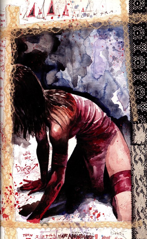
All of this provides the backdrop for Vision Quest. As the title suggests, Maya goes out on her own to try to heal her wounds and think through what has happened to her. The result is a character study told in stream of consciousness, which circles through her memories and her visions, often depicted in a highly iconic manner. This, for example, is how Quesada depicts the moment where Kingpen kills Maya's father in Parts of a Hole.
Now consider the way this same event gets depicted early in VisionQuest.
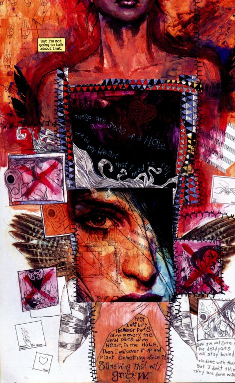
Mack's page combines multiple modality -- multiple ways of depicting the world -- with highly iconic and abstract images existing alongside hyper-realistic images of the same characters. This radical mixing of style is a hallmark of Mack's work, constantly forcing us to think about how things are being represented rather than simply what is being represented. Consider this abstract rendering of the key events -- Fisk is reduced to his big feet and legs, much as he might be seen as a child, while the breakup become Matt and Maya is rendered by the figure of the child ripping a picture of the two of them in half.
We are operating here within the theater of Maya's mind, yet she is also presenting these events to us with an open acknowledgment that as readers we need to have her explain what is taking place.
Once the book has established these rich icons, they can be recycled and remixed for emotional impact. This image builds on the first in several ways. Mack juxtaposes a more mature version of Maya with her child self here and the childlike drawings are repeated to again represent key emotional moments in her life. While Mack repeats the purple of the earlier image, the dominant color that we associate with Maya on this page is red, a color which captures her passion and rage. She has moved from a vulnerable child victim into someone who has the capacity to strike back at those who have caused her pain.
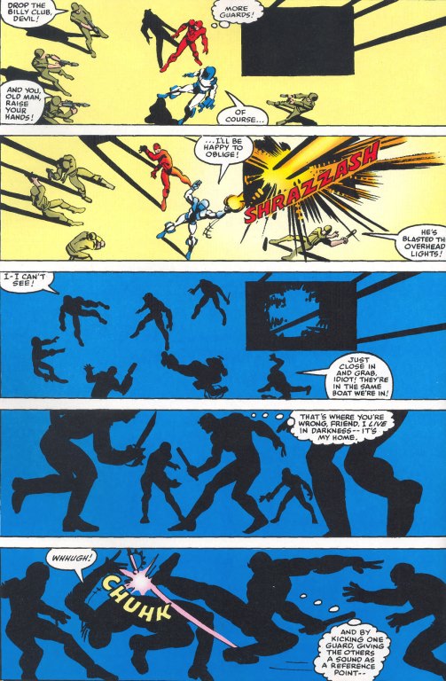
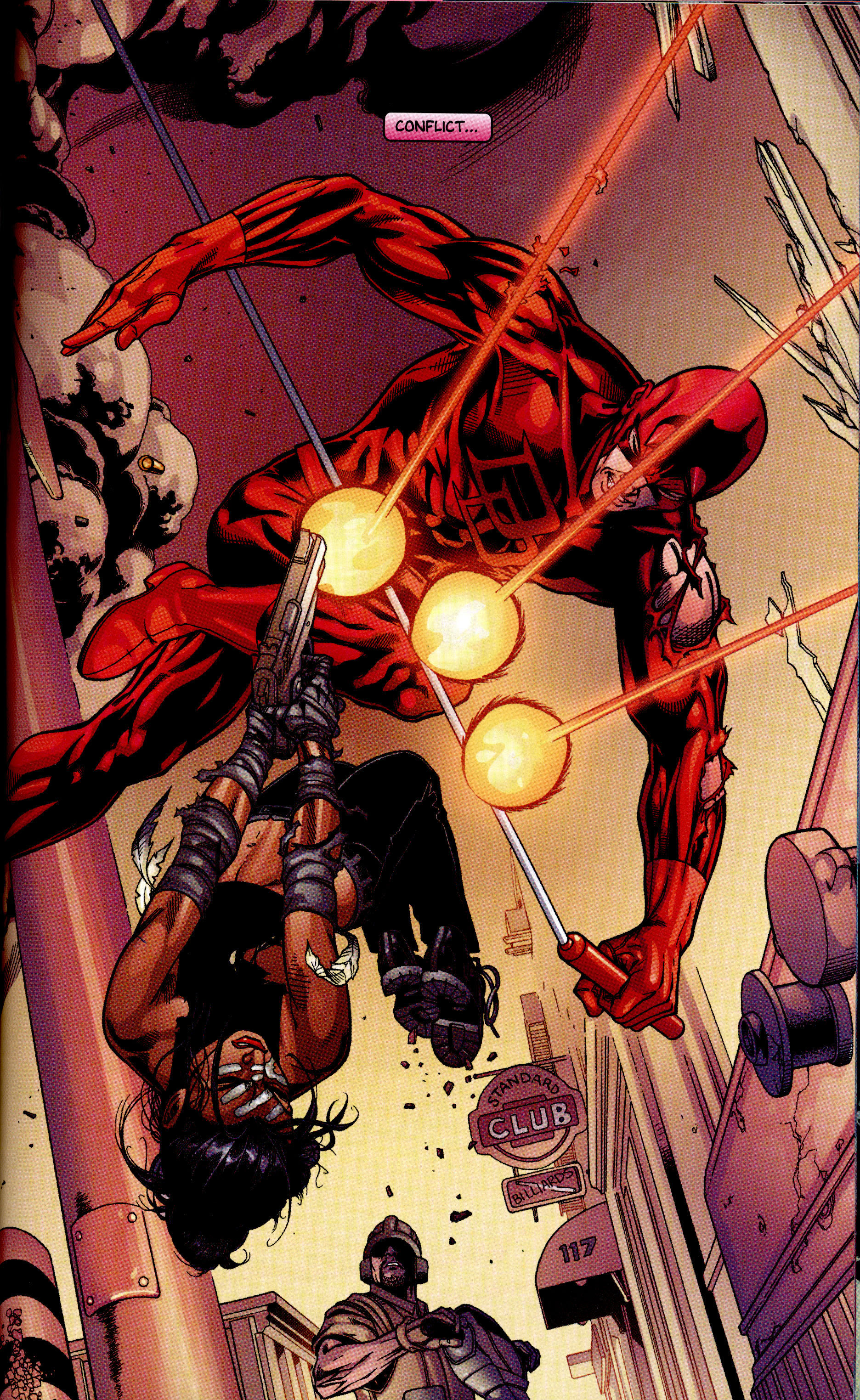
Let's pull back for a moment and try to establish some baselines for thinking about what may constitute "zero-degree style" in the superhero tradition. While his work was considered bold and experimental at the time, Frank Miller's run on Daredevil has helped to establish the stylistic expectations for this particular franchise. Miller's style was hyperbolic -- though nowhere near as much so as in his later works, including The Dark Knight Returns, 300, and Sin City. Yet, he also allows us to see some of the ways that superhero style orientates the reader to the action. The goal is to intensify our feelings by strengthening our identification with the superhero and with other key supporting characters. For this to happen, the pages need to be instantly legible. We need to know who the characters are and what's going on at all times, even if you can use minor breaks in conventional style in order to amplify our emotional responses to the action.
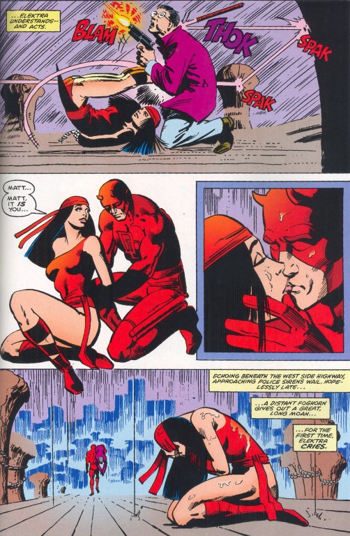
One of the most basic ways that superhero comics do this is through the color coding of key characters, especially the hero and villain, who are depicted in colors that will pop off the page and be distinctive from each other. Electra was designed to in many ways compliment and extend Daredevil so it is no surprise that she is depicted here with the same shade of red.
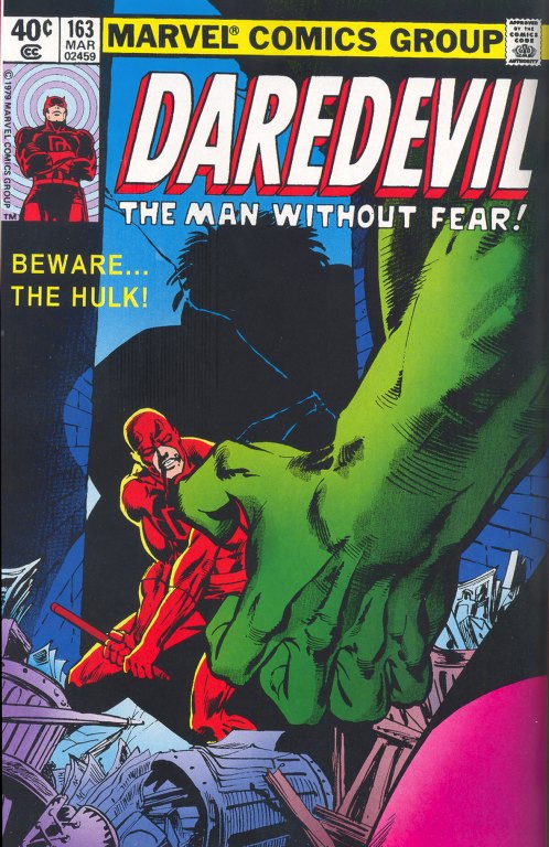
On the other hand, the highly codified colors of the Marvel universe allow us to instantly recognize the Hulk on this cover simply through the image of his arm and the contrasting red and green prepares us for the power struggle which will unfold in this issue.
A second set of conventions center on the depiction of action and the construction of space through framing. Miller was especially strong in creating highly kinetic compositions which intensify the movement of the characters.
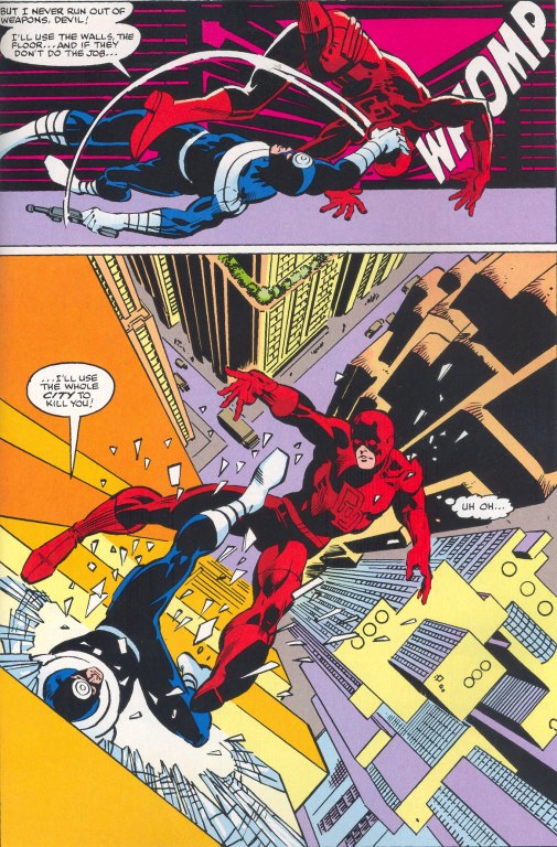
In this first page, we see Daredevil falling away from us into the city scape below, while in the second Miller uses extremely narrow, vertical panels set against a strong horizontal panel to show the superhero's movements through space.
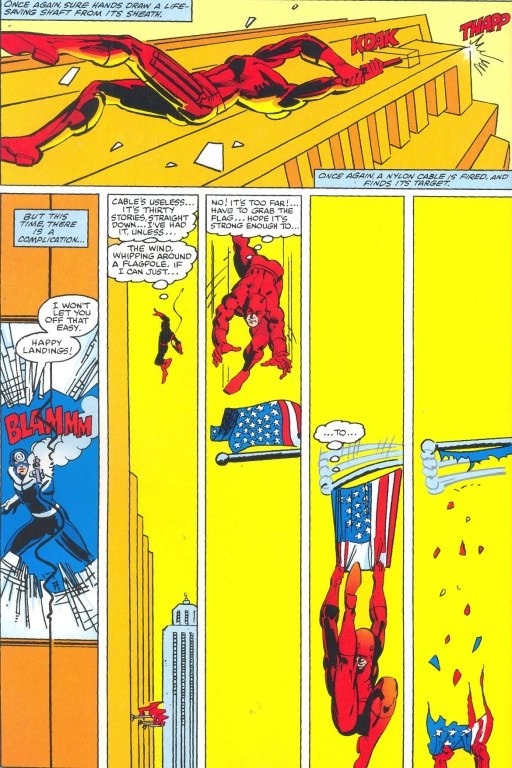
Both of these pages break with the classic grid which is the baseline in these comics, but their exaggerated framing works towards clearly defined narrative goals. This next page breaks with our expectations that each panel captures a single moment in time by showing multiple images of the Daredevil in a way intended to convey a complex series of actions.
while here we seem to be looking straight down on the action in the top panel and subsequent panels are conveyed in silhouette, though again, there is such a strong emphasis on character motivation and action that we never feel confused about what is actually happening here.
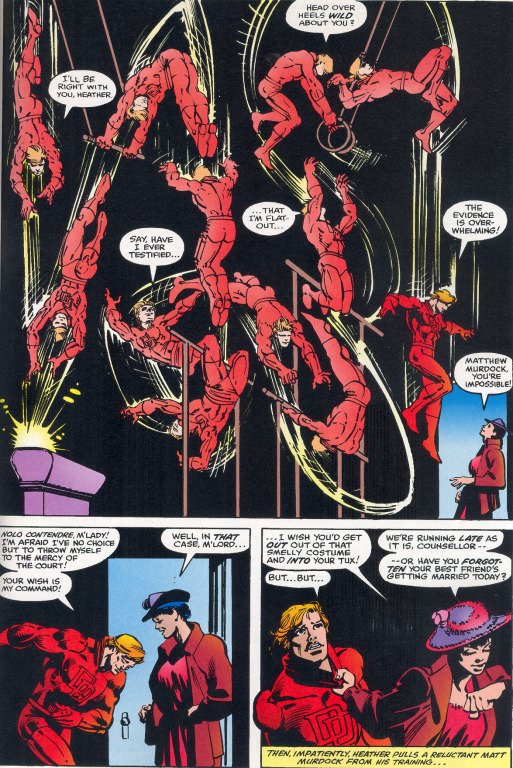
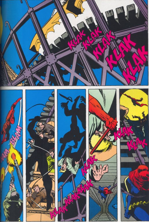
This next image shows other kinds of formal experiments which still fall squarely within the mainstream of the superhero genre -- notice how the text becomes an active element in the composition and notice how the falling character seems to break out of the frame, both ways of underlying the intensity of the action.
Now, let's contrast the layering of text here with the ways that Mack deploys text in Vision-Quest.
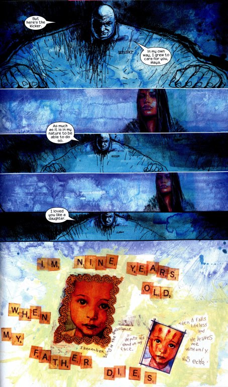
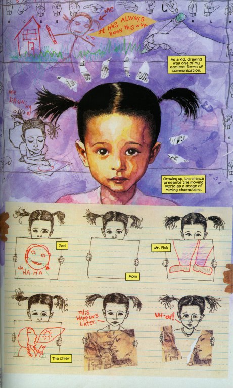
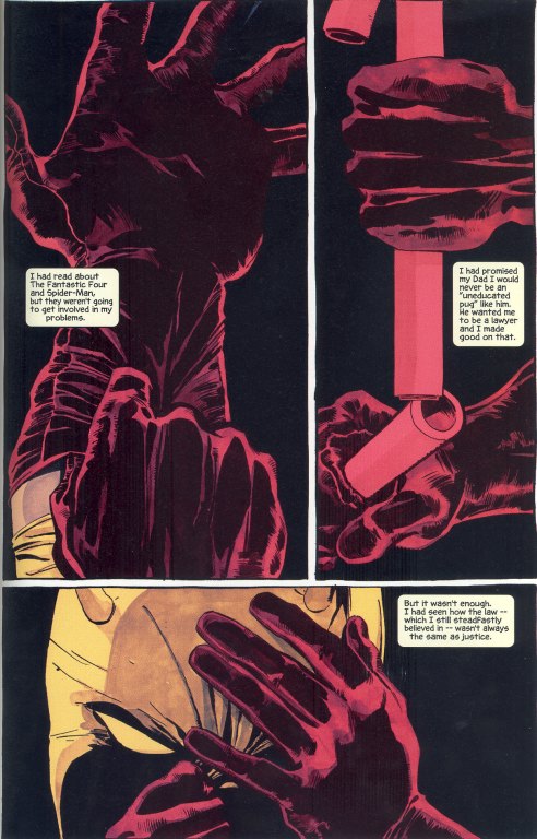
Notice for example the ways Mack deploys several different kinds of texts -- printed fonts, handwritten, and the Scrabble tiles each convey some aspects of the meaning of the scene. We have to work to figure out the relationship between these different kinds of texts, which suggest different layers of subjectivity that are competing for our attention. When I first read this book, I was especially moved by the ways that the hand print on Echo's face -- which elsewhere in the book is simply another marker of her supervillain identity -- here becomes a metaphor for the last time her father touched her, moments before his death, and the sense memory it left on her, an especially potent metaphor when we consider the ways that the character is alligned with hypersensitivity and a powerful "body memory" which allows her to replicate physically anything she has ever felt or seen. While the sounds and dialogue emerge from the action in the case of Frank Miller's pages, they are layered onto the depicted events in Mack's design, part of what gives the page the quality of a scrapbook, recounting something that has already happened, rather than thrusting us into the center of the action.
The key elements of Miller's style come through here -- the use of color to separate out the characters, dynamic compositions which emphasize character action, repeated images of the character within the same frame, flamboyant use of text, and the bursting through of the frame, all combine to make this a particularly intense page.
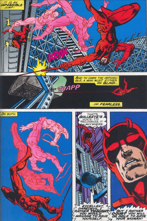
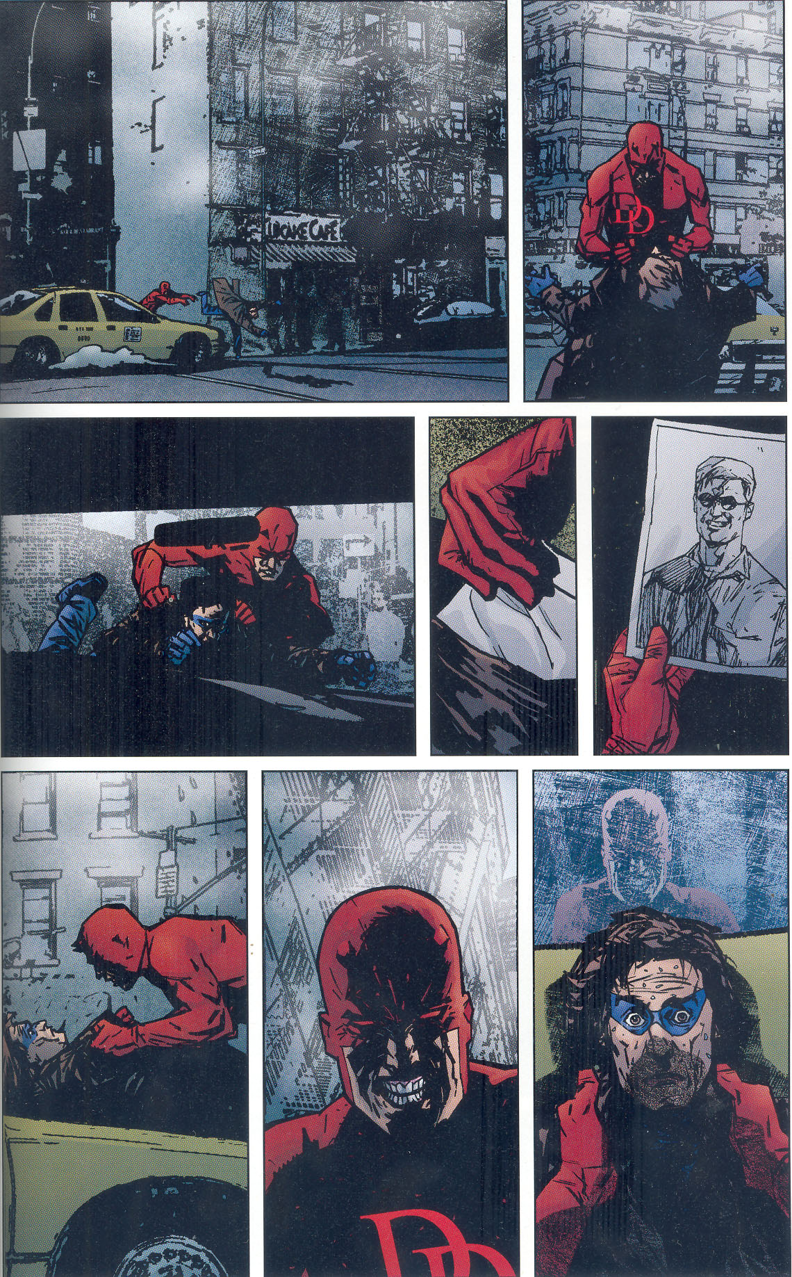
Where most superhero artists seek to covey this sense of intense action in almost every frame, Mack seeks to empty the frame of suggestions of action, seeming to suspend time. Consider this depiction of Daredevil battling Echo from Quesada's work for Pieces of a Hole.
The splash page traditionally either indicates a particularly significant action or a highly detailed image, both moments of heightened spectacle. Mack, on the other hand, often empties this splash pages so we are focusing on the character's emotional state rather than on any physical action.
Having established these conventions of representation, the mainstream comic may tolerate a range of different visual styles as different artists try their hand on the character, often working, more or less, within the same continuity. So, we can see here how Tim Sale plays with color to convey the character's identity even through fragmented images which focus on one or another detail of Daredevil's body.
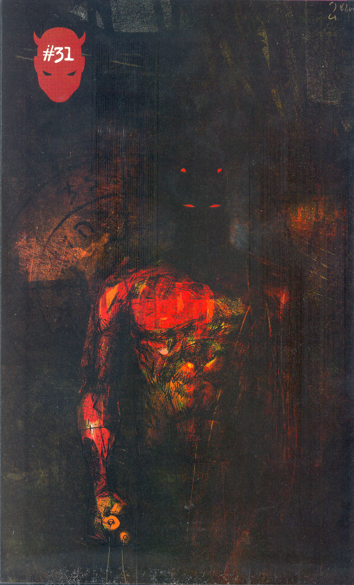
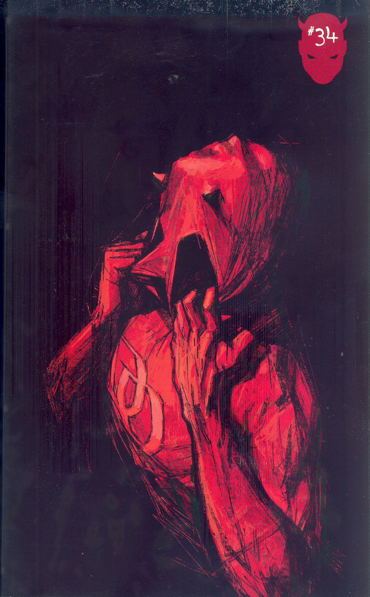
Or here we see how Alex Maleev creates a much more muted palette and a scratchy/grainy image which marks his own muted version of the hyperbolic representations of the character in earlier Daredevil titles.
The mainstream comics allow some room for bolder formal experiments but most often these come through the cover designs rather in the panel by panel unfolding of the action.
Mack's artwork functions this way in relation to Bendis's Alias, where he was asked to design covers that did not look like conventional superhero covers and that might be seen as more female-friendly, reflecting the genre bursting nature of the series content which operates on the very fringes of Marvel's superhero universe.
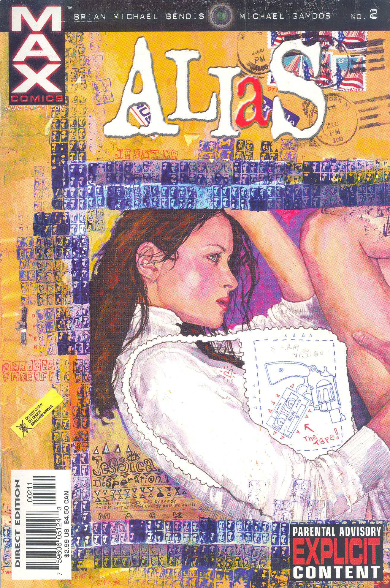
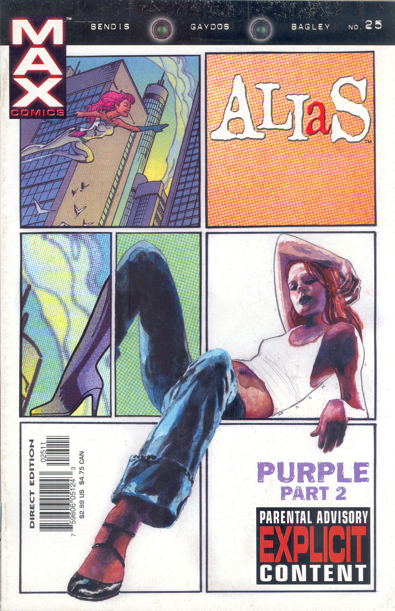
The tension between genres is especially visible on this later cover from the series which shows how its protagonist is and is not what we expect from women in a superhero comic.