Ben Greenman’s Museum of Silly Charts
My interest in charts springs primarily from my disinterest in charts. Reality is so messy. Nothing that passes for a fact ever really is one. When I was a kid, infographics were intoxicating because they promised a world of order, and it’s specifically this promise that has come, over time, to seem like a cruel deception. You’ll never really get an elegant presentation of so-called facts that accurately and meaningfully represents reality. So, as much as I’m drawn to those charts, I’m also drawn to charts that obfuscate, or thwart, or somehow sharpen our sense of the absurdity of trying to accurately present and analyze information.
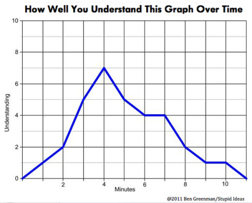
I haven’t spent my life making charts. Who has? This recent run of charts comes from an odd source: a new novel. I have to date published seven books of fiction, and I’m working on my eighth, which is a novel about a man who might not like his life very much. One of the characters in the novel is a chart artist, though he prefers the word “graphist” to “chartist.” In the course of creating the character, I thought it was a good idea to make a few charts, mostly for my own benefit, to try to better understand the process he goes through. I have done this kind of thing before — for “Please Step Back,” a novel I wrote about a funk-rock star, I wrote a number of song lyrics, and even collaborated with the legendary Swamp Dogg on a title song for the novel. For this new book and the chart artist in it, I started to make charts. The first one I thought of, though not the first one I made, was “How Well You Understand This Graph Over Time.” It seemed like the perfect self-annihilating thing, capable of both making people laugh and making them furious. This is the graph that started it all, in a sense. I have had it in my head for years. The character in my book has made this graph at some point, and it gets him thinking about what graphs really are. I think this graph has a tremendous amount to teach us, and also nothing to say.
When I thought of this one, it led to more — I stayed up half the night inventing those kind of recursive chart-jokes. Another one I liked and that I will show later is a bar graph titled “Number of Pennies Stacked Behind the Various Bars of This Graph.” The bars were of random height but on the top of them there was a number indicating how many pennies I had stacked behind them. Again, this made a mockery of the entire process of charting at the same time that it used the fundamental grammar of charting. No one seemed to like that one.
After that, I couldn’t stop, at least not for a little while. I kept trying to think of the ultimate non-graph graph. At some level, it’s comedy, but I want it also to be tragedy — a kind of erosion of the core morality of charts.
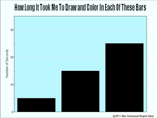
This one may be the truest graph ever. The only think I’ll say here is that results may vary depending on the graph artist. I am pretty slow at drawing and coloring in. Maybe the pen I’m using has too fine a point.
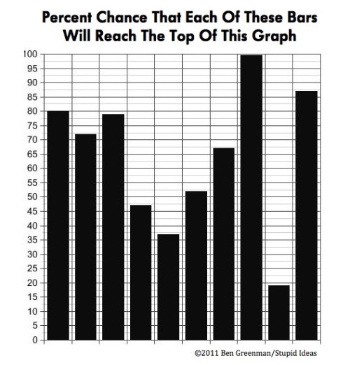
Unless this is the truest graph ever. We spend much of our time looking at charts, graphs, and infographics and analyzing their conclusions. Have they presented data in a straightforward manner? Are their conclusions defensible? This graph tries to represent that process as tautological and indisputable, and I think it does a pretty good job.
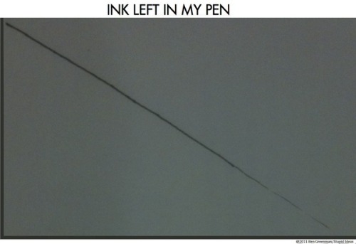
I have one pen that I hate. I got it years ago as part of a prize in college, and I sort of want to keep it, but no matter how many refills I buy, it never works especially well. It has a particular function, though, and it’s to help me make this graph.
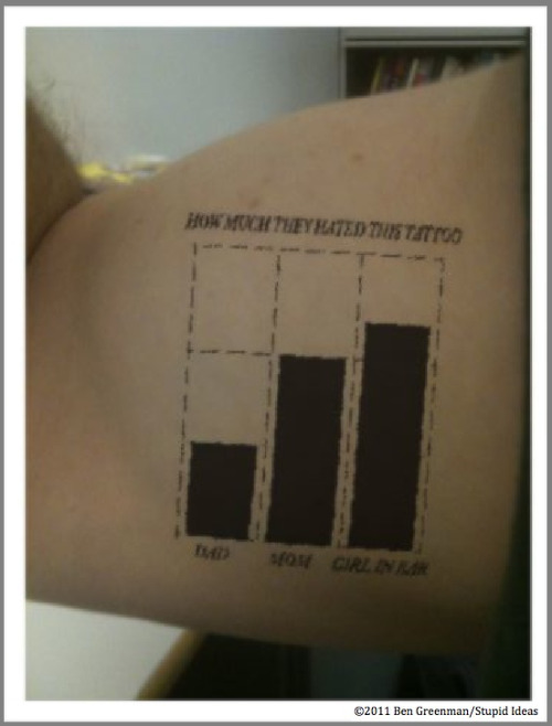
Charts that eat their own chronology interest me greatly. They twist up the one thing we take for granted: the passage of time. So this especially self-referential tattoo graph, which isn’t so readable unless you scrutinize it (like many tattoos), says “How Much They Hated This Tattoo,” and then has Dad (small bar), Mom (bigger bar), and Girl in Bar (biggest bar).
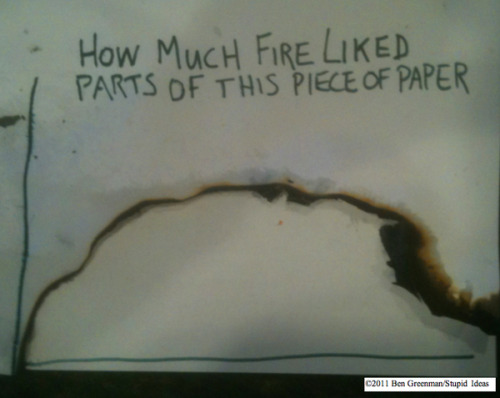
Nature makes its own graphs, and as I am part of nature, I thought I’d follow suit. This was actually the third try — the first two almost got away from me, and the chart was almost “How Much I Had to Pay to Rebuild My House After Comedy Turned To Tragedy In the Blink Of An Eye.”
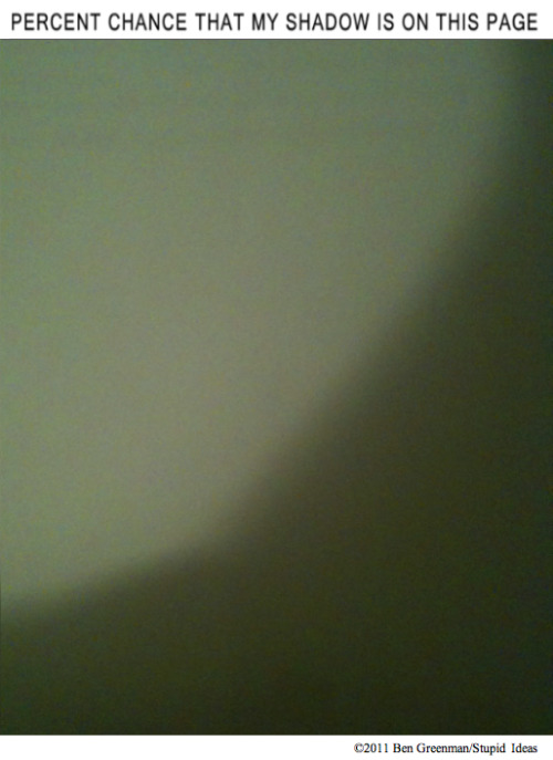
The fire chart scared me, and so I went in search of a safer naturally occurring graph. At first I couldn’t think of what it should be, so I tried to think of who might know. As it turns out, the shadow knows.

After I made the Percent Chance These Bars Will Reach the Top of the Graph (see previous), which is tautologically true, I wanted to make a graph that couldn’t possibly be true. That’s this one, which changes every time you look at it, but can’t change, because, well, it’s already printed.

Fairly late in the game, I started making charts that actually took some work, as opposed to a moment of Conceptual Epiphany. This one was, in its own way, very time consuming, and it turned out to be almost interesting beyond its fundamental pun. “Almost interesting” is the key. The digits, as I assumed, are almost evenly distributed. If there had been any statistically significant variation, I probably would have thrown out the graph.
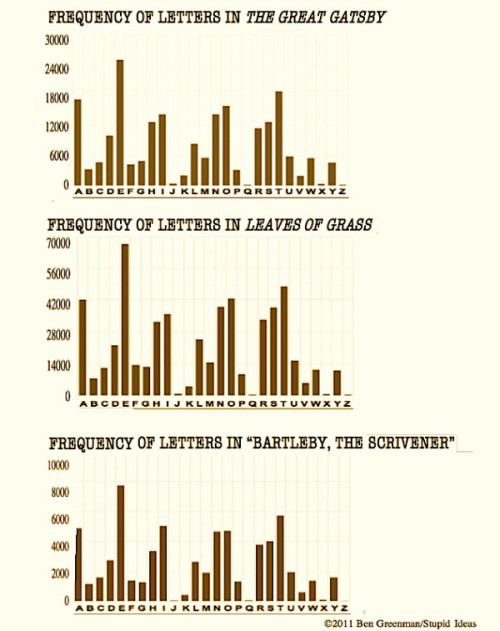
This graph, too, took quite a bit of work, and I was surprised to see that it actually yielded some results. The Great Gatsby has more g’s than f’s, which is uncommon, and may have something to do with West Egg and East Egg. But like the Pi Graph (see previous), it’s interesting mostly for having more art and less matter.
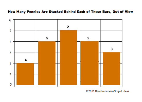
This is my favorite graph, I think. It operates entirely on a principle of misdirection. There are bars, but all they’re doing is hiding pennies. It makes me laugh every time I see it. I also like it because no one else seems to. It’s like a rescue dog.
Done.
Maybe the good charts be yours.