On May 13th, I celebrated the end of a year-long thesis project by presenting Carebook to my family and friends and the IxD community onstage. I’ll be posting up the video of the talk and the panel discussion shortly.
For now, I want to share that Carebook has a new home here at: http://www.carebookapp.com/. It includes all these posts here in Tumblr, albeit in a slightly more formatted way, and it also has a summary of the final product, which I didn’t blog about yet.
When it came to creating a logo for Carebook, I wasn’t really sure what I wanted. All I (kind of) knew was that I wanted Carebook to give off a sense of nurturing, trust and love for the people using it. And that it would steer clear of looking healthcare-y.
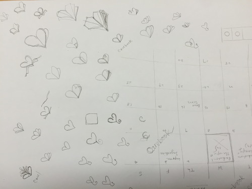
As wary as I am of relying on symbols that are too widespread and iconic, I still gravitated toward the the symbol of a heart for Carebook for some reason. I wanted to tinker with it in such a way to make it look like a book, because Carebook.
So that was really all I knew I wanted going in. And to say that there’s a straightforward process in designing a logo—or anything, for that matter—would be a lie. In reality, there’s a whole lot of experimentation and trial and error until you somehow land on something that feels right. Here are the 23409101 hearts I drew out:
And this:
Three or four hours in, I arrived at something like this:
I liked the direction it was headed in, but it still felt kind of flat and sparse still. A friend’s feedback was that it wasn’t clear enough that the heart was trying to reference a book. One or two hours—and literally, like three grey bars later—I found my logo! That’s my type of design for you.
Not surprisingly, one of the biggest barriers to launching Carebook—and any current digital health product, for that matter—will be fundraising. Who will pay for it?
I’m more than certain this question will come up in my thesis defense (in 2 days!) and while I have a vague strategy, I’ve no solid business plan. So I’ve been doing some research on business models, business plans, all that fun stuff. This article was helpful, so I’m putting it up here for reference.
Aside from experimenting with yet another new color theme (teal and orange felt almost too playful for a healthcare app, pink feels more nurturing), I spent V3 of Carebook re-designing the messaging feature.
Though I didn’t know it at the time, implementing in a direct messaging channel between doctors and patients as I did in V2 sets me up for a hefty design challenge. To tackle that challenge, I’d have to defend the following assumptions and address the following questions:
Assumption
Doctors and nurses have the time and interest in their day to reliably respond to questions
Doctors and nurses have a device on hand to respond
A direct messaging channel scales well to a hospital
Questions
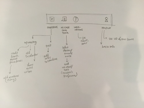
Would there be a doctor/nurse-facing interface for Carebook? If so, what are the functions?
What’s the framework that would guide patients how to use the message feature? How do you make sure they use it meaningfully (for instance, so that care members aren’t getting the same questions from different people over and over again)?
How much can be discussed over a messaging channel? Any HIPPA policies affecting this?
Ultimately, I decided it wasn’t a direction worth pursuing, because it adds a lot of unnecessary complexity and wouldn’t do the best job at communicating and accomplishing my underlying goal—to encourage patients and families to be more involved and proactive in their interactions with their care team—anyway.
Even if it does, I realized I still wouldn’t be able to properly defend the third assumption listed, because of what I’d learned from my prior research on hospital communication systems. With no universal standard in hospitals for what devices doctors and nurses use and how they communicate with patients and their colleagues, it doesn’t make sense to technologically enforce a new and single way of talking to patients.
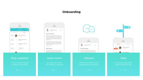
To that end, I scoped things down and pursued a more lightweight and adoptable approach of allowing patients to log notes for themselves. In doing so, the patient wouldn’t have to worry about keeping it in mind (especially when they already have so many other things to worry about in a time of crisis) or forgetting to ask it, as Carebook would smartly remind him/her at just the right time. A quick demo of the flow is shown above.
Because the time we can spend with doctors and nurses is limited, I think this new iteration does well in ensuring patients are prepared enough beforehand to engage meaningfully and productively with their care team. Not only that, it strongly communicates my vision of patients playing a more empowered role in their own healthcare.
Next up on the blog, I’ll share the feedback I received on this new direction taken.
In search of inspiration for my thesis process website/book, I browed through the architecture portfolio book I made ages ago when I applying to jobs / grad school.
Looking back, it’s kind of amazing to see how abstract and artsy the projects eventually turned out to be, even when thinking applied to it was so rigorous and systems-driven. Thought it might be cool to share some spreads I made for it.
My second iteration of Care Planner was driven largely by my intention to make the app feel more human and less “sterile.”
The first big change I made was thus the revision of the name Care Planner to Carebook, which to me sounds more colloquial and less transaction-y. I also experimented with a new color theme of teal and pink, which I thought might be more playful. Lastly, I made a conscious attempt to pair the care team member’s face with the respective procedure, in order to make the whole app feel less intimidating and to more importantly encourage a more personal interaction when the doctor and patient do meet in person.
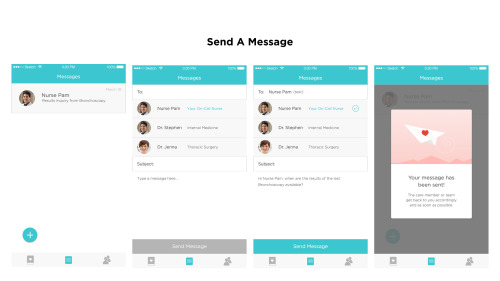
Meanwhile, I also took this chance to start fleshing out the various flows in my app. The first of which is the flow a patient or loved one takes in communicating with the care team. In this first version, they are able to select a pre-populated list of care members that they’ve worked with or will work with, write a note, and send it off to them in a medium the care member has selected. To infuse more personality or “human-ness” into what I know can often be a stressful and cold hospital experience, I thought about incorporating whimsical illustrations at specific touch points of the app.
Here are some sketches I did prior:
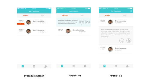
Also explored were two new interactions of being able to “peek” at one’s procedure explanations, in case he/she didn’t need or want to read up extensively on what it meant, and to share procedure scheduling information with one’s contacts. I played around with two ways in which this could take form. In V1, one could pull back on a procedure tab to reveal a short one-sentence description and two CTAs. In V2, I wasn’t too clear about what the interaction would be, but it would expand to reveal the description and CTAs directly between the procedure tabs.
Feedback
For feedback, I showed this app to a few of my classmates. They were a fan of the illustrations and the new color scheme. However, they were confused and concerned about how the Messaging feature would work out in practice, especially given that doctors and nurses all rely on varied devices and methods to communicate with each other. For instance, how would a doctor or nurse respond if he/she doesn’t have a phone? How do care members select their preferred mode of contact? Also, what type of information can be sent through and how is the app able to automatically get the contact information of each care team member? How do you filter out the urgent messages from the trivial ones?
Needless to say, I soon realized that incorporating a messaging system would be another huge design challenge in and of itself and would require more thought and exploration. Is that worth exploring in the little time that I had left for thesis and is that an absolutely must-have for my final proof of concept prototype?