Charting a High-Tech 'Get a Coffee, Give a Coffee' Experiment
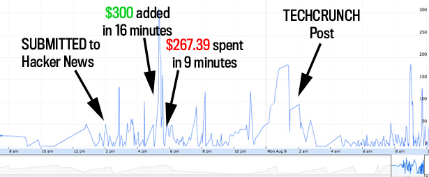
Late last month, mobile app designer Jonathan Stark decided to try a little experiment. He took his Starbucks card, which had $8.47 on it, and created a simple way to share it. People could simply scan the barcode at any store and pay for their drink for free. Or they could add money to the card, so that others could drink for free. He called it "Get a coffee, give a coffee" and created a Twitter feed (@jonathanscard) that allowed you to track how much money was on the card. What you see above is a chart of its balance over the last several weeks.
As you can see, at first, there was a minispike and a bunch of people used the card, driving the balance up over $50 and then quickly back down. It settled out into a steady pattern for the next few weeks, staying within a tight envelope between 0 and 25 dollars. Then, as knowledge of the card began to spike yesterday, the balance started to fluctuate wildly. The balance shot up all the way to $310 yesterday afternoon before being drained all the way down and then shooting up several more times. During the viral times when the link is spreading rapidly, it appears the pattern is that someone will put a bunch of money and then a group will draw it down before a new benefactor appears. In calmer times, the balance remains lower but more consistently.
Take a look at the Google Spreadsheet. Anyone else see any interesting patterns in the data?
Here's my annotation of the last day or so.