As far as data analysis is concerned, Twitter is primarily used for retrospective tracking of sentiment and other social data, but could geolocated Tweets be used to plan for the future?
Data-mapping work by Eric Fischer suggests that it could. If the volume of geo-tagged Tweets is used a proxy for traffic levels, urban planners could use this data to fine-tune existing transport networks and establish where new routes are needed.
Fischer took millions of geolocated Tweets from across the world, cross-referenced them with data on known transport nodes, and used the results to plot the most heavily used routes in cities, countries and continents.
He then created what are in effect transit cartograms, with the thickness of a road or other mass transport line corresponding to the volume of Tweets sent along its path.
Below is a selection of the maps he produced. The full series of images can be found here at Fischer's Flickr account.
British Isles

Fischer created this map using data from over one million Tweet-based trips in August 2011. Advocates of HS2 may feel somewhat vindicated.
Europe

Using data from Twitter covering 60,000 trips, aggregated within a ten mile radius, Fischer created this map of Europe's transport network. He acknowledges that disproportionately high Twitter usage levels in England and the Netherlands has skewed the overall picture.
New York City

Broadway shows clearly as the most heavily used route, with subway networks also well-defined.
San Francisco Bay Area
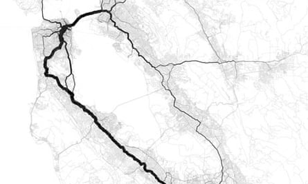
Trips across the bay and along the peninsula dominate, though aggregation radii make it difficult to know exactly which road or rail line was being used.
Chicago
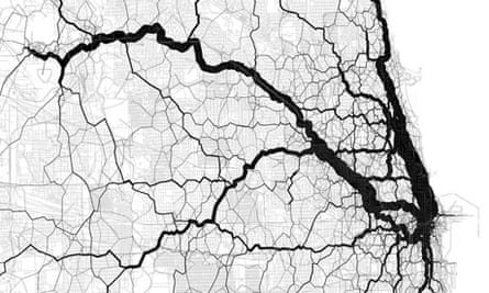
The Chicago map was made by plotting ten thousand Twitter-sourced points over an OpenStreetMap grid. Fischer points out that the thicker line heading to the southwest doesn't correspond to any major road or rail line.
What can you spot in the data?
NEW! Buy our book
Facts are Sacred: the power of data (on Kindle)
More open data
Data journalism and data visualisations from the Guardian
World government data
Search the world's government data with our gateway
Development and aid data
Search the world's global development data with our gateway
Can you do something with this data?
Flickr Please post your visualisations and mash-ups on our Flickr group
Contact us at data@guardian.co.uk





Comments (…)
Sign in or create your Guardian account to join the discussion