Update #1: While flying Charlotte to New York City: Wednesday, May 7, 08:38
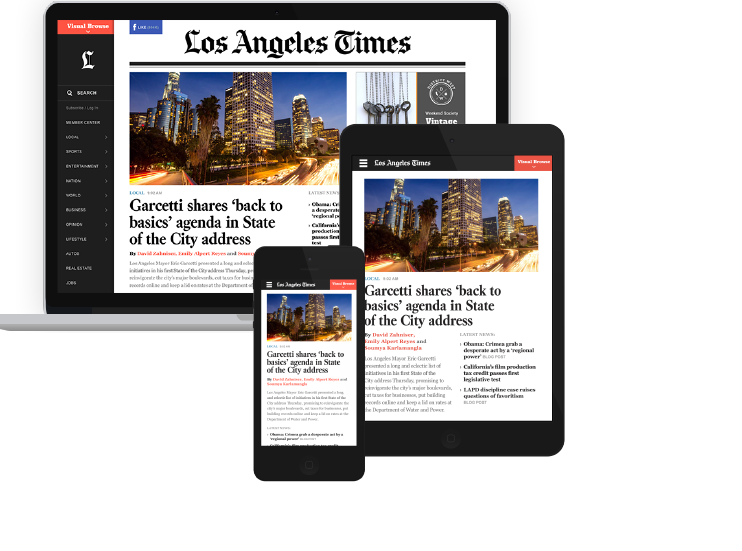
The new LA Times website: across platforms, responsive design
I was on my way to take a tour of the new Los Angeles Times website, but bumped into the Etihad Airlines ad and also took a tour of their much viewed “suites” called The Residence: the world's first three-room cabin in the sky .
Both are innovative and inspire lean-back behavior.
Stretch out in one of those gorgeous beds Etihad is promoting, and, more importantly, relax and study what the Times has achieved with their newly unveiled website.
Exquisite comes to mind. Not a word I use often, and definitely not to describe newspaper websites.
Here, utility meets aesthetics like we have not seen in a newspaper website in a long time. Easy and pleasant on the eyes but with a sense of urgency. Who said these two things could not be achieved at the same time?
If Spring Cleaning is the time to clear out the clutter, those folks at latimes.com hired a full cleaning crew to do theirs.
White space makes an entrance and we welcome it: between labels and headlines, between headlines and summaries, and all around.
Let the eyes lean back while our minds lean forward: a combination that every web designer must remember.
Navigation is fun and innovative: I like the visual browser–touch it and you can navigate by photos in a mosaic. Nice touch.
The three essentials of website design
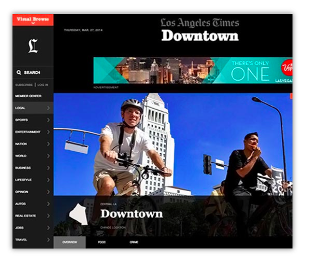
Find your neighborhood news
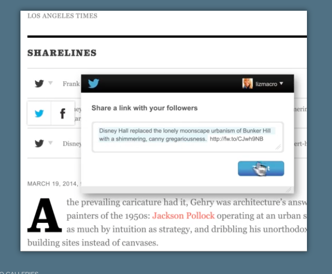
Sharelines: clever feature
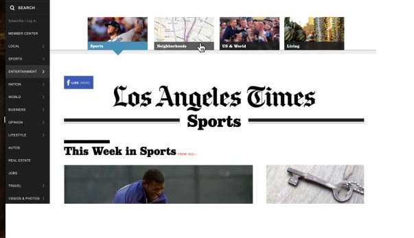
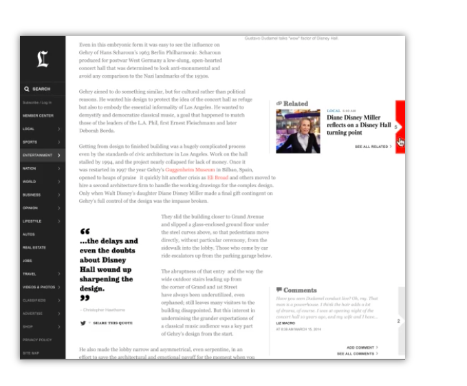
Easy to find related stories
All good editorial design emphasizes appropriateness, a point of view (attitude?), and that instant moment where we associate the look & feel with the product. The new latimes.com excels in all three:
Appropriateness: The Los Angeles Times is an iconic daily newspaper. It is produced in Hollywood. It has a rich journalistic history. The new website says all of this in five seconds.
Point of view: Along the same lines, we see how the content flows here; I like that you can type the name of your neighborhood and explore relevant stories in it. Try Malibu! The point of view of an authoritative publication rings true here. One of the panels on the home page leads to The Homicide Report (just type in your neighborhood to get the data).
Look & Feel: It is elegant, classy and it reminds us that the Los Angeles Times is the newspaper for anyone who likes a serious, credible (but fun) read, highlighting its best writers with their photos in Times' Voices. It reassures us, with a section called LA Now, that it is all about the “now,” the latest news, in addition to all the other surprises its content offers.
In the “Uniqueness” department, there are two features I like a lot: In Case You Missed It for those stories that may have passed us by, and Sharelines, a cool feature providing pre-composed tweets and Facebook posts for sharing stories we like (send it to friends, or post on social media).
The best surprise, in my view: that in 2014 a newspaper the size of the Los Angeles Times can stop and rethink its website to offer us a textbook example of how it can be done. From its sense of hierarchy, starting with Top News, to its iconic typefaces, LA Headline (Kis) and Belizio, to the layering of content and use of white space, every newspaper website designer should take a look.
While at it, and if you are a frequent traveler with me, picture yourself leaning back on one of those Etihad three-room cabins in the sky.
Two win win situations, the latimes.com and Etihad's three rooms with a sky view. Three wins if you count the revenue generated by the LA Times while fronting its new website with the Etihad advertisement.
Another view on latimes.com from the great Roger Black
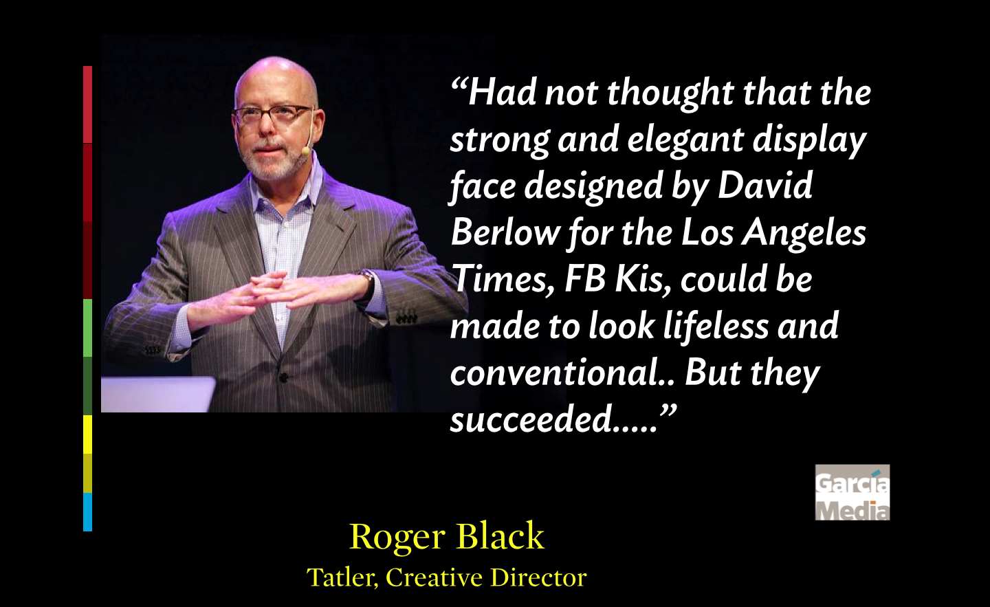
Roger Black wil/l be my lunch companion today, as he visits New York City from his new home in Hong Kong: I asked him his thoughts about the new http://latimes.com
On the whole the typography is too heavy and too big. The attempt to leaven it with white space, just slows you down. The basic Vox.com-like stacking here is oddly confusing. When you actually get to a story on mobile, there is so much other stuff at the top (e.g., FB and Twitter sprites), that you are disinclined to read it.
There seems to be differentiation in the templates for opinion stories or features.
The visual browser is a good thing, but why does it go sideways, when everything else is vertical?
Had not thought that the strong and elegant display face designed by David Berlow for the Los Angeles Times, FB Kis, could be made to look lifeless and conventional.. But they succeeded.
Of related interest:
The Los Angeles Times reimagined
http://www.codeandtheory.com/things-we-make/the-los-angeles-times-reimagined
The evolution of the LA Times