
CSS Variables (officially known as custom properties) are user defined values that can be set once and used many times throughout your codebase. They make it easier to manage colors, fonts, size, and animation values, and ensure consistency across web applications.
For example, you can set a brand color as a CSS property ( --primarycolor: #7232FA) and use this value in any components or style that uses your brand color (background: var(--primarycolor);).
Besides offering cleaner and non-repetitive code, CSS variables can be used to build color palettes, improve responsiveness, and create dynamic type systems.
This post is extracted from my guide, CSS Master, which teaches you to write better, more efficient CSS. You’ll also learn to master tools that will improve your workflow and build better applications.
Key Takeaways
Defining a CSS Custom Property
To define a custom property, select a name and prefix it with two hyphens. Any alphanumeric character can be part of the name. Hyphen (-) and underscore (_) characters are also allowed. A broad range of Unicode characters can be part of a custom property name. This includes emoji, but for the sake of clarity and readability, stick to alphanumeric names.
Here’s an example:
--primarycolor: #0ad0f9ff; /* RGB alpha hexadecimal color notation */The -- indicates to the CSS parser that this is a custom property. When used as a variable, the parsing engine replaces the property with its value.
Custom property names are case-sensitive. That means --primaryColor and --primarycolor are considered two distinct property names. That’s a departure from traditional CSS, in which property and value case don’t matter. It is, however, consistent with the rules for variable names in ECMAScript.
As with other properties, such as display or font, CSS custom properties must be defined within a declaration block. One common pattern is to define custom properties using the :root pseudo-element as a selector:
:root {
  --primarycolor: #0ad0f9ff;
}
:root is a pseudo-element that refers to the root element of the document. For HTML documents, that’s the <html> element. For SVG documents, it’s the <svg> element. Using :root makes properties immediately available throughout the document.
Using a CSS Variable
To use a custom property as a variable, we need to use the var() function. For instance, if we wanted to use our --primarycolor custom property as a background color, we’d do the following:
body {
    background-color: var(--primarycolor);
}
Our custom property’s value will become the computed value of the background-color property.
To date, custom properties can only be used as variables to set values for standard CSS properties. You can’t, for example, store a property name as a variable and then reuse it. The following CSS won’t work:
:root {
    --top-border: border-top; /* Can't set a property as custom property's value */
    var(--top-border): 10px solid #bc84d8; /* Can't use a variable as a property */
}
You also can’t store a property–value pair as a variable and reuse it. The following example is also invalid:
:root {
    --text-color: 'color: orange'; /* Invalid property value */
}
body {
    var(--text-color); /* Invalid use of a property */
}
Lastly, you can’t concatenate a variable as part of a value string:
:root {
    --base-font-size: 10;
}
body {
    font: var(--base-font-size)px / 1.25 sans-serif; /* Invalid CSS syntax */
}
CSS Custom Property vs. CSS Variable
“Custom property” is a future-proof name that accounts for how this feature might be used someday. This could change, however, should the CSS Extensions specification be implemented by browser vendors. That specification defines ways to extend CSS with custom selector combinations, functions, and at-rules.
We commonly call custom properties “variables”, and to date, that’s the only way we can use them. In theory, they’re not entirely interchangeable terms. In practice and for now, they are. I’ll mostly use custom properties in this post, since that’s their proper name. I’ll use variables when it makes the sentence clearer.
Setting a Fallback Value
The var() function accepts up to two arguments. The first argument should be a custom property name. The second argument is optional, but must be a declaration value. This declaration value functions as a fallback or default value that’s applied when the custom property value isn’t defined.
Let’s take the following CSS:
.btn__call-to-action {
    background: var(--accent-color, deepskyblue);
}
If --accent-color is defined—let’s say its value is #f30 —then the fill color for any path with a .btn__call-to-action class attribute will have a red-orange fill. If it’s not defined, the fill will be a deep sky blue.
Declaration values can also be nested. In other words, you can use a variable as the fallback value for the var function:
body {
    background-color: var(--books-bg, var(--arts-bg));
}
In the CSS above, if --books-bg is defined, the background color will be set to the value of the --books-bg property. If not, the background color will instead be whatever value was assigned to --arts-bg. If neither of those are defined, the background color will be the initial value for the property—in this case, transparent.
Something similar happens when a custom property has a value that’s invalid for the property it’s used with. Consider the following CSS:
:root {
    --text-primary: #600;
    --footer-link-hover: #0cg; /* Not a valid color value */
}
body {
    color: var(--text-primary);
}
a:link {
    color: blue;
}
a:hover {
    color: red;
}
footer a:hover {
    color: var(--footer-link-hover);
}
In this case, the value of the --footer-link-hover property is not a valid color. Instead, footer a:hover inherits its color from that of the <body> element.
Custom properties are resolved in the same way other CSS values are resolved. If the value is invalid or undefined, the CSS parser will use the inherited value if the property is inheritable (such as color or font), and the initial value if it’s not (as with background-color).
Cascading Values
Custom properties also adhere to the rules of the cascade. Their values can be overridden by subsequent rules:
:root {
    --text-color: #190736; /* navy */
}
body {
    --text-color: #333;  /* dark gray */
}
body {
    color: var(--text-color);
}
In the example above, our body text would be dark gray. We can also reset values on a per-selector basis. Let’s add a couple more rules to this CSS:
:root {
    --text-color: #190736; /* navy */
}
body {
    --text-color: #333;   /* dark gray */
}
p {
    --text-color: #f60;  /* orange */
}
body {
    color: var(--text-color);
}
p {
    color: var(--text-color)
}
In this case, any text that’s wrapped in <p> element tags would be orange. But text within <div> or other elements would still be dark gray.
You can also set the value of a custom property using the style attribute—for example, style="--brand-color: #9a09af".
Custom Properties and Color Palettes
Custom properties work especially well for managing HSL color palettes. HSL stands for hue, saturation, lightness. It’s a light-based color model that’s similar to RGB. We can use HSL values in CSS thanks to the hsl() and hsla() color functions. The hsl() function accepts three arguments: hue, saturation, and lightness. The hlsa() function also accepts a fourth argument, indicating the color’s alpha transparency (a value between 0 and 1).
While an RGB system expresses color as proportions of red, green, and blue, HSL uses a color circle where hue is a degree position on that circle, and the tone or shade are defined using saturation and lightness values. Saturation can range from 0% to 100%, where 0% is gray and 100% is the full color. Lightness can also range from 0% to 100%, where 0% is black, 100% is white, and 50% is the normal color.
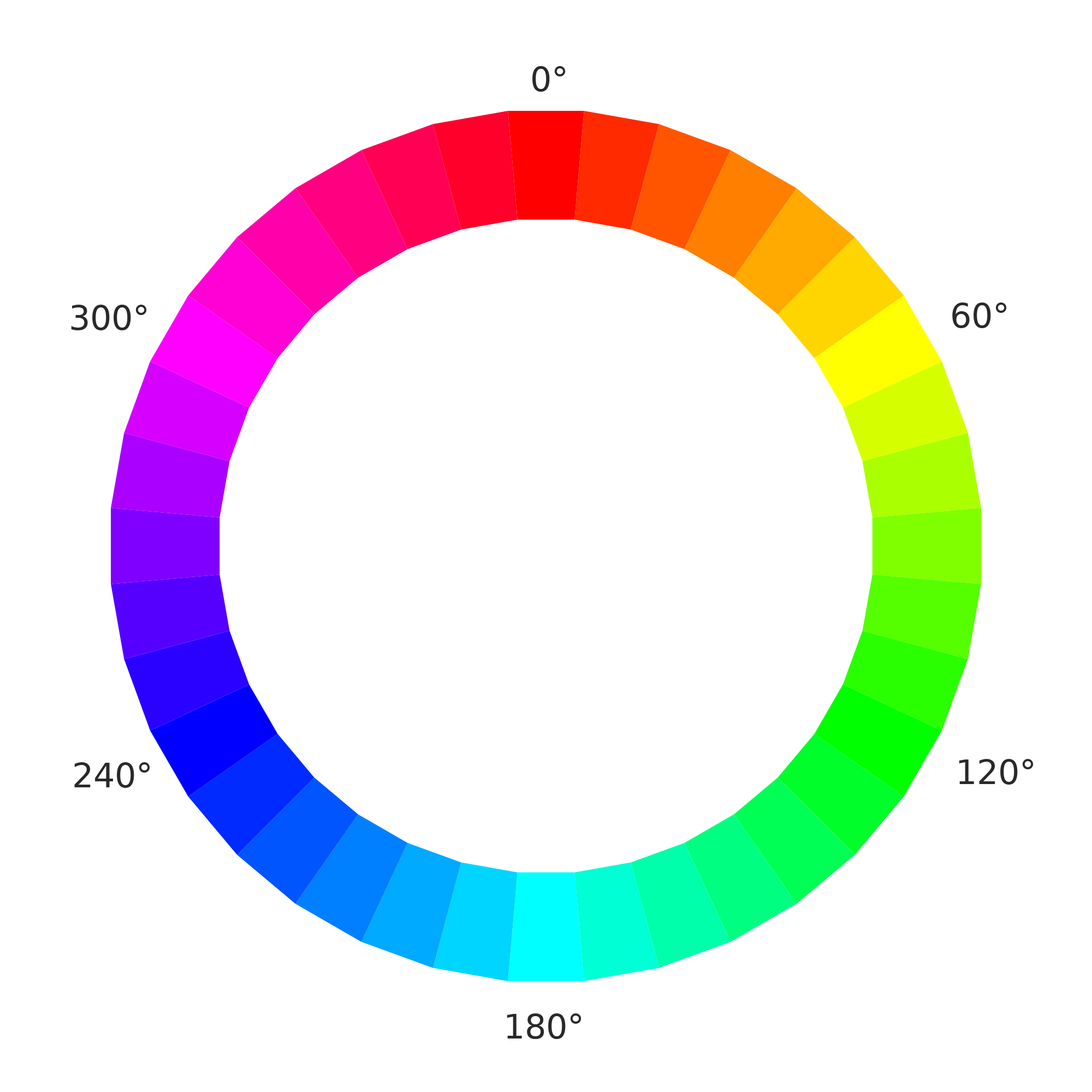
Chromatic Wheel by CrazyTerabyte from Openclipart.
In the HSL color system, the primary colors red, green, and blue are situated 120 degrees apart at 0 degrees/360 degrees, 120 degrees, and 240 degrees. Secondary colors—cyan, magenta, and yellow—are also 120 degrees apart, but sit opposite the primary colors, at 180 degrees, 300 degrees, and 60 degrees/420 degrees respectively. Tertiary, quaternary, and other colors fall in between at roughly ten-degree increments. Blue, written using HSL notation, would be hsl(240, 100%, 50%).
HSL Argument Units
When you use a unitless value for the first argument of the hsl() and hsla() functions, browsers assume that it’s an angle in degree units. You can, however, use any supported CSS angle unit. Blue can also be expressed as hsl(240deg, 100%, 50%), hsl(4.188rad, 100%, 50%) or hsla(0.66turn, 100% 50%).
Here’s where it gets fun. We can set our hue values using a custom property, and set lighter and darker shades by adjusting the saturation and lightness value:
:root {
    --brand-hue:      270deg;  /* purple */
    --brand-hue-alt:  .25turn; /* green */

  /*
    hsl() and hsla() can accept comma-separated or space-separated arguments,
    but older browsers (such as Internet Explorer 11) only support
    comma-separated arguments.
  */

    --brand-primary:   hsl( var( --brand-hue ) 100% 50% );
    --brand-highlight: hsl( var( --brand-hue ) 100% 75% );
    --brand-lowlight:  hsl( var( --brand-hue ) 100% 25% );
    --brand-inactive:  hsl( var( --brand-hue )  50% 50% );

    --brand-secondary:     hsl( var( --brand-hue-alt ) 100% 50% );
    --brand-2nd-highlight: hsl( var( --brand-hue-alt ) 100% 75% );
    --brand-2nd-lowlight:  hsl( var( --brand-hue-alt ) 100% 25% );
    --brand-2nd-inactive:  hsl( var( --brand-hue-alt )  50% 50% );
}
The CSS above gives us the palette shown below.
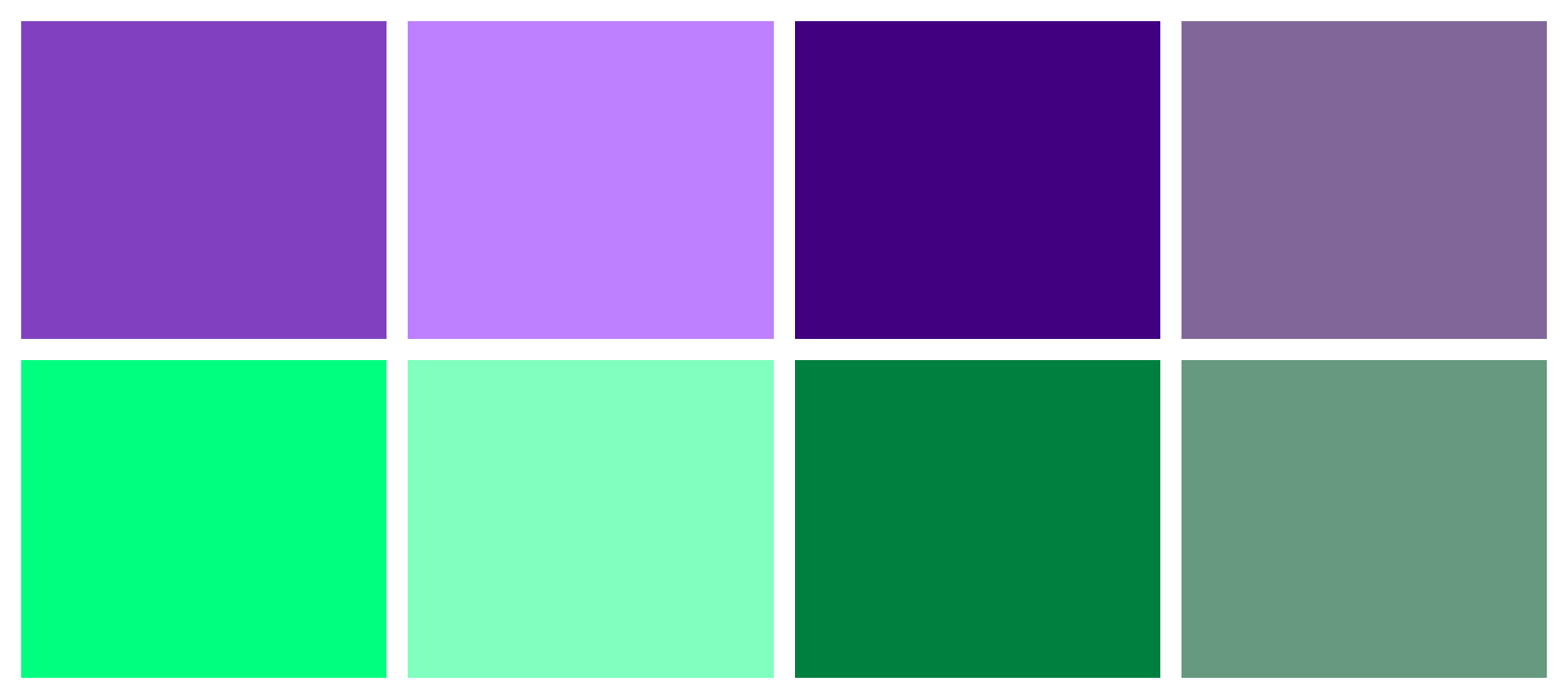
This is a simple version, but you can also use custom properties to adjust saturation and lightness values.
Robust Palette Generation
Dieter Raber discusses a technique for robust palette generation in “ Creating Color Themes With Custom Properties, HSL, and a Little calc() ”.
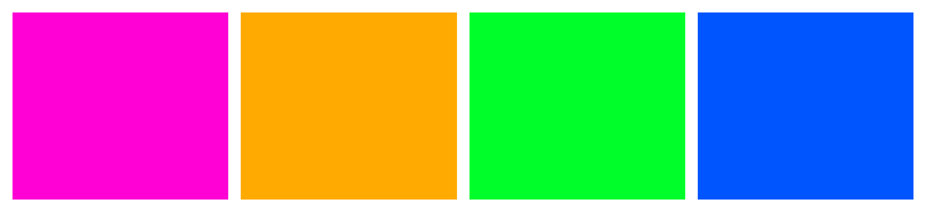
Another idea is to combine custom properties and the calc() function to generate a square color scheme from a base hue. Let’s create a square color scheme in our next example. A square color scheme consists of four colors that are equidistant from each other on the color wheel—that is, 90 degrees apart:
:root {
    --base-hue: 310deg; /* Hot pink */
    --distance: 90deg;

    --color-a: hsl( var(--base-hue), 100%, 50% );
    --color-b: hsl( calc( var(--base-hue) + var( --distance ) ), 100%, 50% );
    --color-c: hsl( calc( var(--base-hue) + ( var( --distance ) * 2 ) ), 100%, 50% );
    --color-d: hsl( calc( var(--base-hue) + ( var( --distance ) * 3 ) ), 100%, 50% );
}
This bit of CSS gives us the rather tropical-inspired color scheme shown below.
Custom properties also work well with media queries, as we’ll see in a later section.
Using CSS variables to make a Dark Theme palette
You can use CSS Custom Properties to define sets of variables for both dark and light themes on your site.
Take the below example of a page’s styles, we can replace all HSL colors in different selectors with variables after defining custom properties for the corresponding colors in :root:
:root{
  /*...*/
  --nav-bg-color: hsl(var(--primarycolor) , 50%, 50%);
  --nav-text-color: hsl(var(--primarycolor), 50%, 10%);
  --container-bg-color: hsl(var(--primarycolor) , 50%, 95%);
  --content-text-color: hsl(var(--primarycolor) , 50%, 50%);
  --title-color: hsl(var(--primarycolor) , 50%, 20%);
  --footer-bg-color: hsl(var(--primarycolor) , 93%, 88%);
  --button-text-color: hsl(var(--primarycolor), 50%, 20%);
}
Appropriate names for the custom properties have been used. For example, --nav-bg-color refers to the color of the nav background, while --nav-text-color refers to the color of nav foreground/text.
Now duplicate the :root selector with its content, but add a theme attribute with a dark value:
:root[theme='dark']{
  /*...*/
}
This theme will be activated if a theme attribute with a dark value is added to the <html> element.
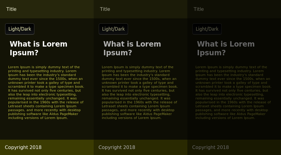
We can now play with the values of these variables manually, by reducing the lightness value of the HSL colors to provide a dark theme, or we can use other techniques such as CSS filters like invert() and brightness(), which are commonly used to adjust the rendering of images but can also be used with any other element.
Add the following code to :root[theme='dark']:
:root[theme='dark'] {
  --dark-hue: 240;
  --light-hue: 250;
  --primarycolor: var(--dark-hue);
  --nav-bg-color: hsl(var(--primarycolor), 50%, 90%);
  --nav-text-color: hsl(var(--primarycolor), 50%, 10%);
  --container-bg-color: hsl(var(--primarycolor), 50%, 95%);
  --content-text-color: hsl(var(--primarycolor), 50%, 50%);
  --title-color: hsl(--primarycolor, 50%, 20%);
  --footer-bg-color: hsl(var(--primarycolor), 93%, 88%);
  --button-text-color: hsl(var(--primarycolor), 50%, 20%);
  filter: invert(1) brightness(0.6);
}
The invert() filter inverts all the colors in the selected elements (every element in this case). The value of inversion can be specified in percentage or number. A value of 100% or 1 will completely invert the hue, saturation, and lightness values of the element.
The brightness() filter makes an element brighter or darker. A value of 0 results in a completely dark element.
The invert() filter makes some elements very bright. These are toned down by setting brightness(0.6).
A dark theme with different degrees of darkness:
Switching Themes with JavaScript
Let’s now use JavaScript to switch between the dark and light themes when a user clicks the Dark/Light button. In your HTML add an inline <script> before the closing </body> with the following code:
const toggleBtn = document.querySelector("#toggle-theme");
toggleBtn.addEventListener('click', e => {
  console.log("Switching theme");
  if(document.documentElement.hasAttribute('theme')){
    document.documentElement.removeAttribute('theme');
  }
  else{
    document.documentElement.setAttribute('theme', 'dark');
  }
});
Document.documentElement refers to the the root DOM Element of the document — that is, <html>. This code checks for the existence of a theme attribute using the .hasAttribute() method and adds the attribute with a dark value if it doesn’t exist, causing the switch to the dark theme. Otherwise, it removes the attribute, which results in switching to the light theme.
Note: You should also use this in combination with the prefers-color-scheme feature in CSS, which can be used to automatically change light/dark themes from a user’s operating system or user agent (browser) setting. This is shown in the next section.
Using Custom Properties and Media Queries
We can also use custom properties with media queries. For example, you can use custom properties to define light and dark color schemes:
:root {
    --background-primary: hsl(34, 78%, 91%);
    --text-primary: hsl(25, 76%, 10%);
    --button-primary-bg: hsl(214, 77%, 10%);
    --button-primary-fg: hsl(214, 77%, 98%);
}
@media screen and ( prefers-color-scheme: dark ) {
    :root {
      --background-primary: hsl(25, 76%, 10%);
      --text-primary: hsl(34, 78%, 91%);
      --button-primary-bg: hsl(214, 77%, 98%);
      --button-primary-fg: hsl(214, 77%, 10%);
  }
}
Similarly, we can use custom properties to change the base font size for screen versus print:
:r:root {
    --base-font-size: 10px;
}
@media print {
    :root {
        --base-font-size: 10pt;
    }
}
html {
    font: var(--base-font-size) / 1.5 sans-serif;
}
body {
    font-size: 1.6rem;
}
In this case, we’re using media-appropriate units for print and screen. For both media, we’ll use a base font size of 10 units—pixels for screen, points for print. We’ll also use the value of --base-font-size: to set a starting size for our root element (html). We can then use rem units to size our typography relative to the base font size.
Using Custom Properties with JavaScript
Remember: custom properties are CSS properties, and we can interact with them as such. For example, we can use the CSS.supports() API to test whether a browser supports custom properties:
const supportsCustomProps = CSS.supports('--primary-text: #000');

// Logs true to the console in browsers that support custom properties
console.log(supportsCustomProps);
We can also use the setProperty() method to set a custom property value:
document.body.style.setProperty('--bg-home', 'whitesmoke');Using removeProperty() works similarly. Just pass the custom property name as the argument:
document.body.style.removeProperty('--bg-home');To use the custom property as a value with JavaScript, use the var() function with the property name as its argument:
document.body.style.backgroundColor = 'var(--bg-home)';Alas, you can’t set custom properties using square-bracket syntax or camelCased properties of the style object. In other words, neither document.body.style.--bg-home nor document.body.style['--bg-home'] will work.
Custom Properties and Components
JavaScript frameworks like React, Angular and Vue let developers use JavaScript to create reusable, sharable blocks of HTML, often with CSS that’s defined at the component level.
Here’s an example of a React component, written in JSX, a syntax extension for JavaScript:
import React from 'react';

/* Importing the associated CSS into this component */
import '../css/field-button.css';

class FieldButtonGroup extends React.Component {
    render() {
        return (
            <div className="field__button__group">
                <label htmlFor={this.props.id}>{this.props.labelText}</label>
                <div>
                    <input type={this.props.type}
                      name={this.props.name}
                      id={this.props.id}
                      onChange={this.props.onChangeHandler} />
                    <button type="submit">{this.props.buttonText}</button>
                 </div>
            </div>
        );
    }
}

export default FieldButtonGroup;
More on JavaScript Frameworks
SitePoint has extensive resources on React, Angular and Vue if you want to learn more about working with JavaScript frameworks. For React, check out Your First Week With React and extensive React articles. For Angular, there’s Learn Angular: Your First Week and plenty of Angular articles and tutorials. For Vue, check out Jump Start Vue.js and more Vue articles.
Our React component imports CSS into a JavaScript file. When compiled, the contents of field-button.css are loaded inline. Here’s one possible way to use this with custom properties:
.field__button__group label {
    display: block;
}
.field__button__group button {
    flex: 0 1 10rem;
    background-color: var(--button-bg-color, rgb(103, 58, 183)); /* include a default */
    color: #fff;
    border: none;
}
In this example, we’ve used a custom property— --button-bg-color —for the button’s background color, along with a default color in case --button-bg-color never gets defined. From here, we can set a value of --button-bg-color, either in a global stylesheet or locally via the style attribute.
Let’s set the value as a React “prop”. React props (short for properties) mimic element attributes. They’re a way to pass data into a React component. In this case, we’ll add a prop named buttonBgColor:
import FieldButtonGroup from '../FieldButtonGroup';

class NewsletterSignup extends React.Component {
    render() {
        // For brevity, we've left out the onChangeHandler prop.
        return (
            <FieldButtonGroup type="email" name="newsletter" id="newsletter"
              labelText="E-mail address" buttonText="Subscribe"
              buttonBgColor="rgb(75, 97, 108)" />
        );
    }
}

export default NewsletterSignup;
Now we need to update our FieldButtonGroup to support this change:
class FieldButtonGroup extends React.Component {
    render() {
        /*
        In React, the style attribute value must be set using a JavaScript
        object in which the object keys are CSS properties. Properties
        should either be camelCased (e.g. backgroundColor) or enclosed in
        quotes.
        */

        const buttonStyle = {
            '--button-bg-color': this.props.buttonBgColor
        };

        return (
            <div className="field__button__group">
                <label htmlFor={this.props.id}>{this.props.labelText}</label>
                <div>
                    <input type={this.props.type}
                      name={this.props.name} id={this.props.id}
                      onChange={this.props.onChangeHandler} />
                    <button type="submit" style={buttonStyle}>
                      {this.props.buttonText}
                    </button>
                </div>
            </div>
        );
    }
}
In the code above, we’ve added a buttonStyle object that holds the name of our custom property and sets its value to that of our buttonBgColor prop, and a style attribute to our button.
Using the style attribute probably runs counter to everything you’ve been taught about writing CSS. A selling point of CSS is that we can define one set of styles for use across multiple HTML and XML documents. The style attribute, on the other hand, limits the scope of that CSS to the element it’s applied to. We can’t reuse it. And we can’t take advantage of the cascade.
But in a component-based, front-end architecture, one component may be used in multiple contexts, by multiple teams, or may even be shared across client projects. In those cases, you may want to combine the “global scope” of the cascade with the narrow “local scope” provided by the style attribute.
Setting the custom property value with the style attribute limits the effect to this particular instance of the FieldButtonGroup component. But because we’ve used a custom property instead of a standard CSS property, we still have the option of defining --button-bg-color in a linked stylesheet instead of as a component prop.
Conclusion
Custom properties take one of the best features of pre-processors—variables—and make them native to CSS. With custom properties, we can:
- create reusable, themed components
- easily adjust padding, margins, and typography for a range of viewport sizes and media
- improve the consistency of color values in our CSS
Variables have a range of applications, and are particularly useful in component-based design systems.
I hope you now have a better understanding of how to use variables, or custom properties, in CSS. Check out my book, CSS Master, to extend your CSS knowledge and get more helpful tips like these.
FAQs about CSS Custom Properties
CSS Custom Properties, also known as CSS variables, are entities defined by developers to store and reuse values in a stylesheet. They begin with the -- prefix, like --main-color, and can be assigned values to be used throughout the stylesheet.
To declare a CSS Custom Property, use the -- prefix followed by a name, like --main-color. You assign a value to it using the var() function, such as var(--main-color: #3498db).
CSS Custom Properties offer a more flexible and maintainable way to manage styles. They allow for easy theming, quick updates, and centralization of values, promoting cleaner and more modular code.
Yes, CSS Custom Properties can be used for various types of values, including colors, font sizes, spacing, and more. They provide a way to parameterize any value in your stylesheets.
Yes, CSS Custom Properties follow the standard inheritance rules. If a property is not defined on an element, it will inherit the value from its parent. This makes them powerful for creating consistent design systems.
Yes, CSS Custom Properties can be used in media queries. This allows for more dynamic responsiveness by adjusting property values based on screen size or other media features.
 Tiffany Brown
Tiffany B. Brown is a freelance web developer and technical writer based in Los Angeles. Brown offers web development and consulting services to larger agencies and small businesses. A former member of the Opera Software developer relations team, Brown is also co-author of SitePoint's JumpStart HTML5 book. She sporadically writes about web development technology on her blog. You can follow her on Twitter at @webinista.