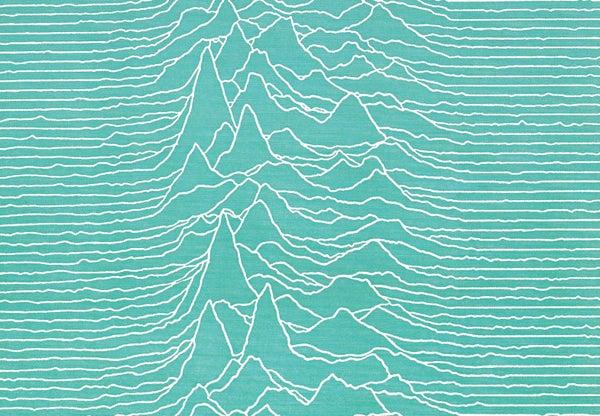
Fifty years ago this month Harold D. Craft, Jr., published a remarkable black-on-white plot in his Ph.D. dissertation at Cornell University. A stacked series of jagged lines displayed incoming radio waves from pulsar CP1919, as detected at Arecibo Observatory in Puerto Rico. Several months later the chart appeared as a full-page visualization in Scientific American, this time with white lines on a field of cyan.
A pulsar is a rapidly rotating neutron star that emits a radio-frequency beam that sweeps through space like a lighthouse beacon. In the graphic, 80 consecutive pulses—recorded at a frequency of 318 megahertz—are stacked. One pulse (shown from left to right) lasts about 0.04 second, with peak intensity near the center. Pulses occur every 1.337 seconds.
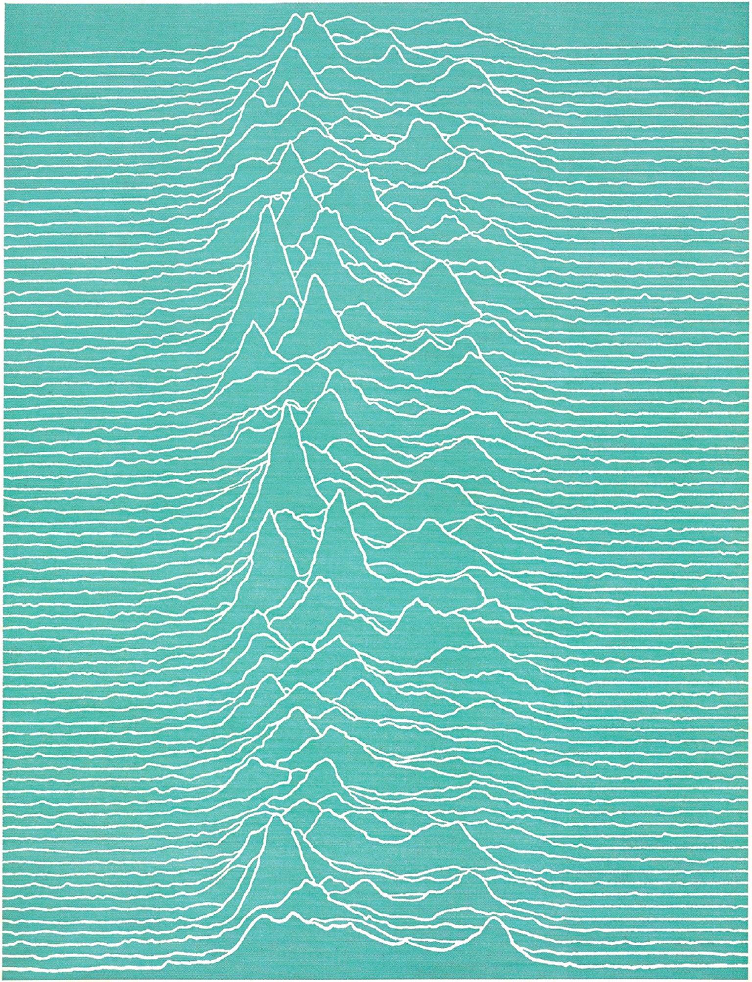
In 1979 the chart took a big step into public consciousness. Designer Peter Saville featured a white-on-black version as cover art for the English rock band Joy Division's Unknown Pleasures album, with no band name, album title or other identifiers—a bold move. On Scientific American's 175th anniversary we honor Craft's work and a data visualization that made the leap from student research to pop culture icon.
On supporting science journalism
If you're enjoying this article, consider supporting our award-winning journalism by subscribing. By purchasing a subscription you are helping to ensure the future of impactful stories about the discoveries and ideas shaping our world today.
Credit: Harold D. Craft, Jr.; Source: “The Nature of Pulsars,” by Jeremiah P. Ostriker, in Scientific American, Vol. 224; No. 1; January 1971, modified from “Radio Observations of the Pulse Profiles and Dispersion Measures of Twelve Pulsars,” by Harold D. Craft, Jr.; September 1970

Scientific American