Publishing science online
Where are we? What is possible? What do we do at Our World in Data?
ETH Zürich
These slides are online at:'Which World Bank Reports Are Widely Read?'

Doemeland and Trevino (2014). Policy Research Working Paper.
Share of papers not cited once:
12% in medicine 27% in natural sciences 32% in social sciences 82% in humanities
Vincent Larivière, Yves Gingras – The decline in the concentration of citations, 1900–2007 Compare this with: 'Fake Election News Stories Outperformed Real News On Facebook'
(Science) online publications that are not constrained by the limitations of paper
Theory
– To Build a Better Ballot – Mike Bostock’s ‘Visualizing Algorithms’ – Ordinary least–squares and other related work – Statistics textbook – Simpson’s paradox one pager – Graph theory and search algorithms
Simulations
– Parable of the Polygons (Schelling Model)
Empirical work
– Bret Victor – Climate Change (Combination of texts and EE) – Big History Project – ‘Ten Brighter Ideas’ by Bret Victor (You can edit the calculations in the source code) – 'Snow Fall' in the New York Times – A Game of Shark and Minnow – One more from the New York Times – fallen.io – The Fallen of World War II
Where to find more explorable explanations?
– The original article 'Explorable Explanations' from 2011 by Bret Victor
– Twitter feed on Explorable Explanations curated by Maarten Lambrechts.
– ExplorabaleExplanations.com curated by Nicky Case
How to make explorable explanations?
Online books
- A very beautiful online book by Jack Schaedler on digital sound signal processing
- Hyndman and Athanasopoulos – ‘Forecasting: principles and practice’
- David Roodman's Microfinance Open Book Blog.
- Piketty put the Appendix of his big book online.
Our World In Data
Visualising the empirical evidence on global development
Our World in Data
The aim is to bridge the gap between academic research and the larger world that wants answers to the questions to which academics already have found answersGlobal Prosperity
Today's rich countries became rich very recently.


Global inequality. This is the distribution in 1988. A clearly devided world.

Changing global inequality.

Changing global inequality.

Changing global inequality.

Changing global inequality.

Changing global inequality.
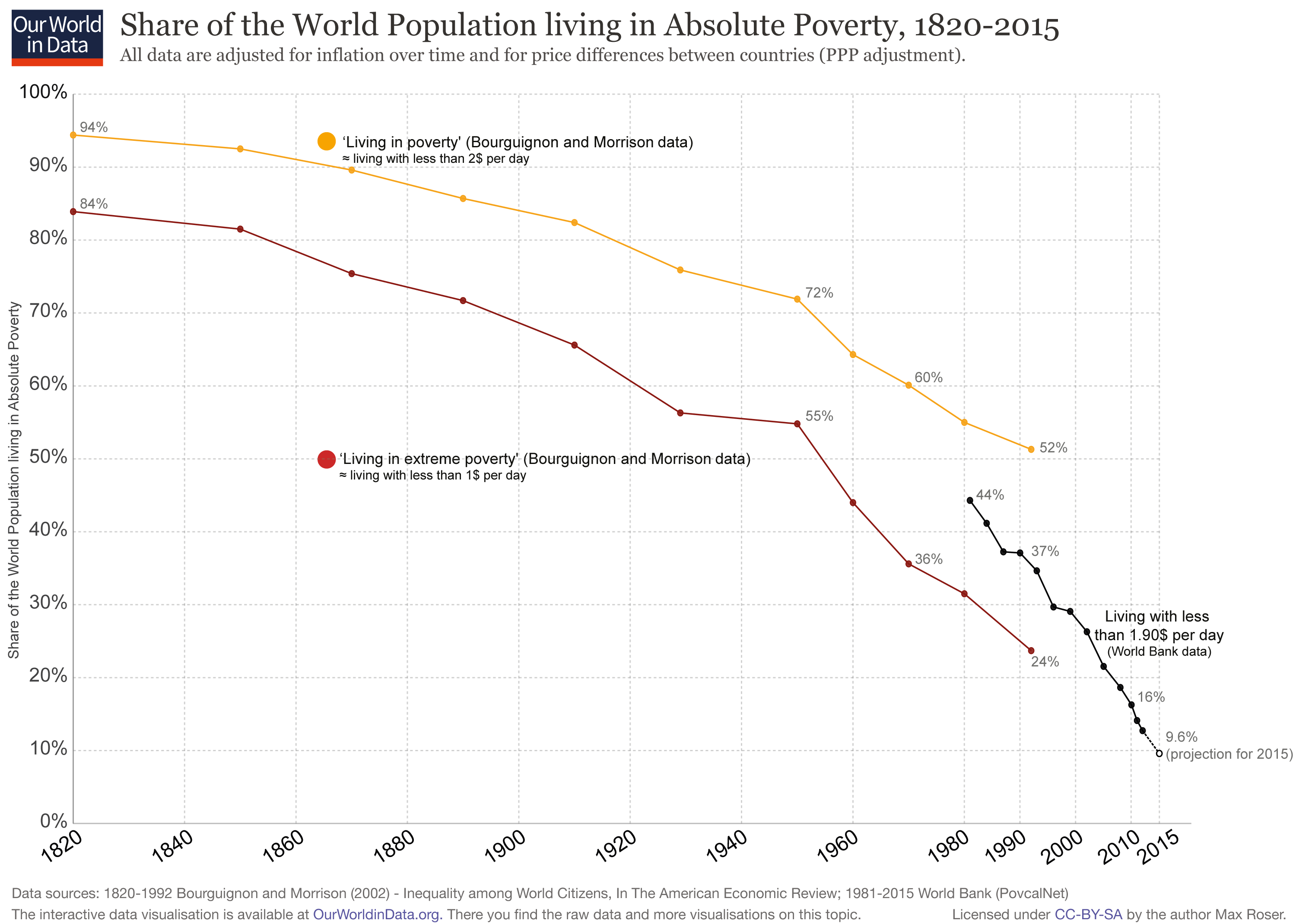
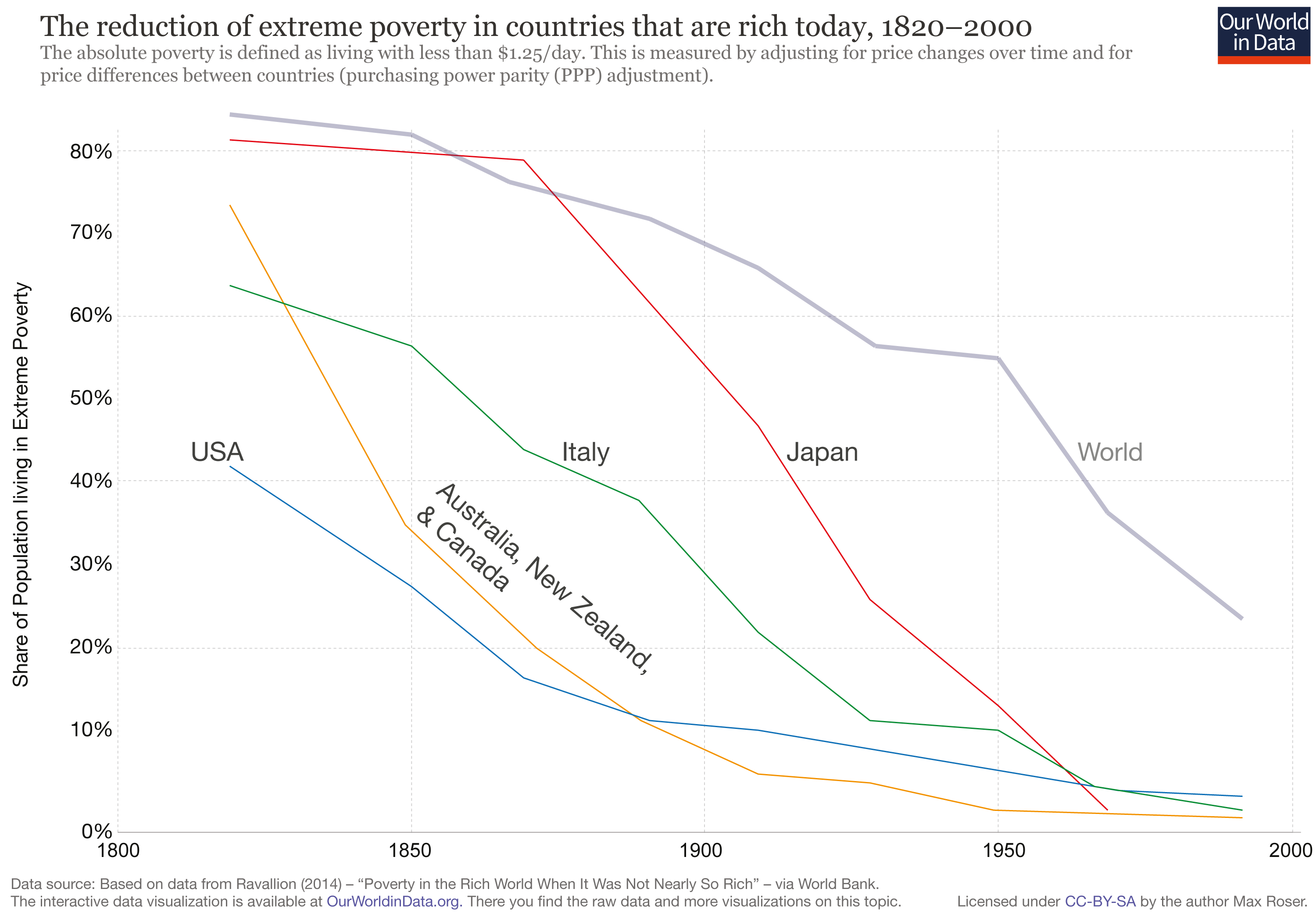
Declining extreme poverty
Declining extreme poverty
.png)
But people do not know that extreme poverty is declining.


Journalism today.
World povertytoday and in the future

746 Million still live in extreme poverty.The world population was 7.18 billion in 2013.
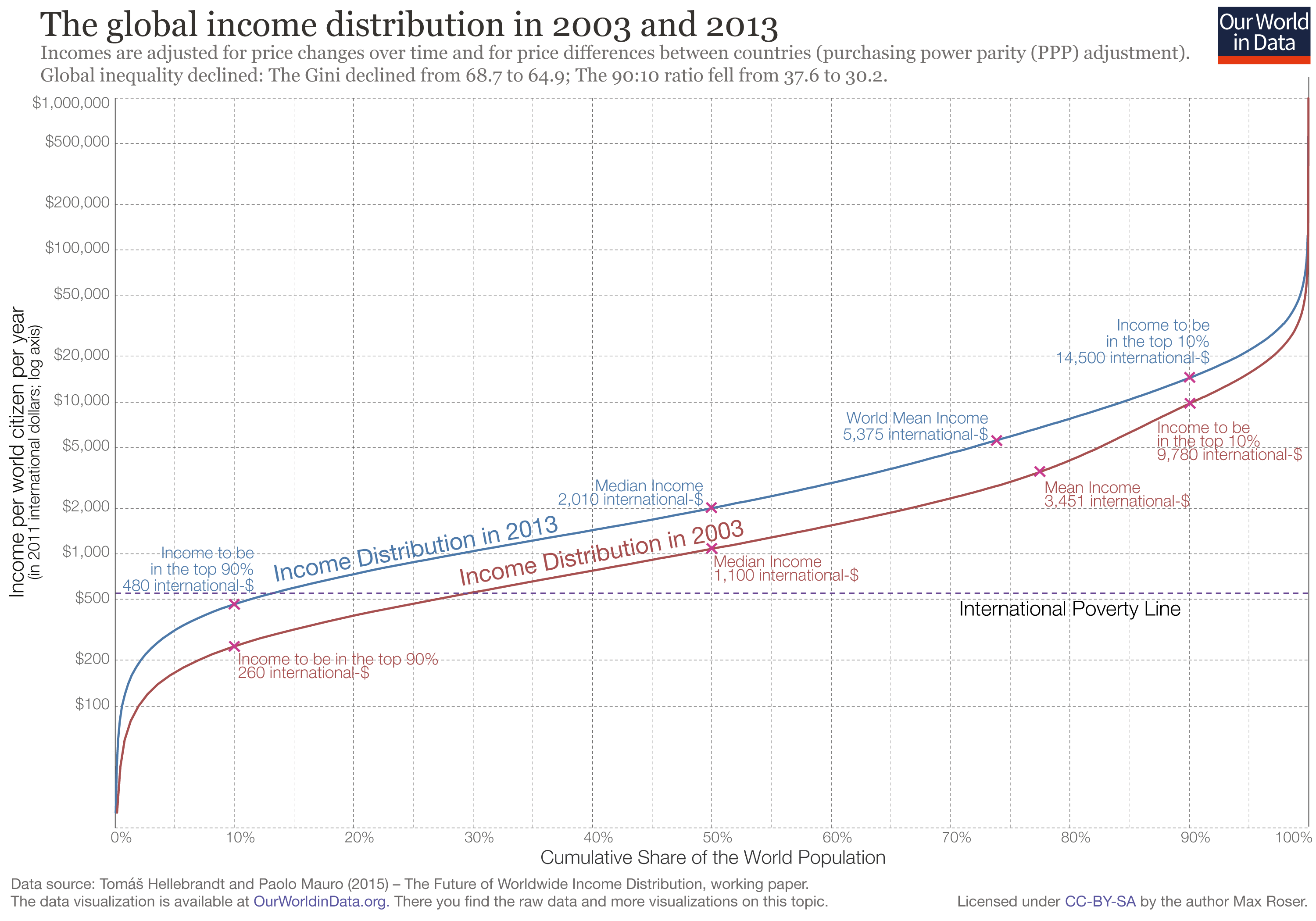

How long does it take for incomes to grow from 480$ to 14,500$?


Poverty and migration

Changing global inequality.


Our World in Data
We are creating an open-access web publication, written for anyone interested in global development, that uses accessible data visualizations to present empirical research on living conditions around the world, how they are changing and why.
We communicate empirical knowledge through 1 – interactive data visualisations (charts and maps) 2 – clear and understandable explanations of the findings of the empirical research on global development.
The goal is to present the best empirical research on global development to an audience of interested readers, journalists, academics, and policy makers.
The entry on income inequality
-
Our World In Data is without any exception available as a public good:
- The publication is freely available online
- The data published on the website is available for download
- The visualizations published in the web publication are made available under a permissive Creative Commons license
- All tools to publish OurWorldInData and to create the visualizations are free to use by everyone (completely open source and available on GitHub)
How our work is used
Collaboration

Collaboration

As background

As data source

As data source

Articles that are written around our work

As platform for others

Integrated in work of others
Teaching material

In lectures (using Reveal.js)
What we are working on

Future work for Our World in Data